 The History of Feminism
The word 'Feminism' is a narrative for the act of advocating for women's rights in the equality of the genders, thus the ideologies towards defending equal economic, social and political rights for females; it is also known as the women's movement. Feminism originated from the French word: Féminisme which first appeared in 1870's France, it then appeared in the UK in the late 19th century. A Feminist organisation called the Suffragettes fought for women's right to vote; the British women's suffrage movement developed in the early 20th century and females often chained themselves to railings in order for their presence and views to be acknowledged.
Those who may have considered themselves Feminists prior to the women's movement are often referred to as protofeminist. During the 19th century Feminism augmented in fiction (Charlotte and Anne Brontë for example), history (such as Florence Nightingale, who proved that women can have the same potential as men but do not have the opportunities) and even fashion when the word Feminism appeared in Vogue 1913. The 'Feminine Ideal' spread through conduct books and depicted the "proper" Victorian image and role for women (periods 1837-1901), and Queen Victoria described this as the "mad, wicked folly of 'Women's Rights'".
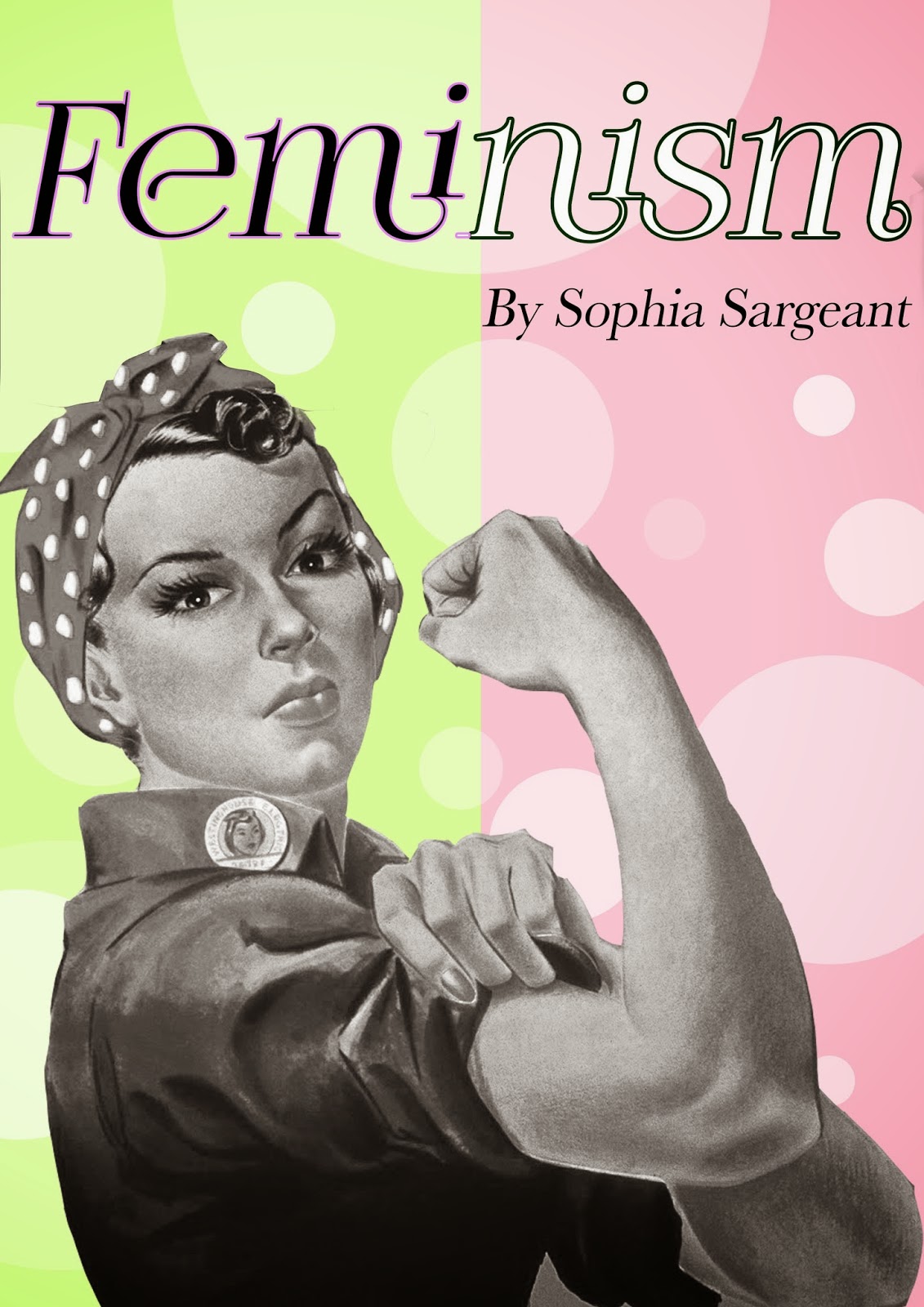
In order to widen my knowledge of existing Feminist Artists as well as gain inspiration, I decided to research the following Artists: Guerrilla Girls, Jenny Holzer, Hannah Wilke, Barbara Kruger and J. Howard Miller. All of the Artists mentioned (except for Hannah Wilke) used typography within their work as their main medium as a form of communication. Some of these Artists also accompany the text with imagery, such as J. Howard Millers "We Can Do It" poster and Barbara Kruger "your body is a battleground".
"We Can Do It" by J.Howard Miller (1943) is a visually pleasing piece which tackles Feminism during the war. Due to its time of creation the piece has similarities to 1950's Pin Up art. The first thing to catch your attention is the use of bold yellow and navy blue; as these colours contrast they cause the colours to advance and catch the spectators attention. It also has a top-down visual processing design so the second thing to catch your eye is the typography, "We Can Do It!", as the font is large and bold it forces you to accept the caption and to look down the piece to see what it is referring to. The stepwise (top-down) design then causes you to notice the females face. The woman is wielding a strong and confident facial expression as opposed to the stereotype of females appearing weak, which emphasises that this piece tackles feminism. Her left hand is then fisted and holding up her sleeve to reveal her right bicep with her fist closed, which again, implies her strength as a woman. There is also a badge joined to the collar of her shirt which depicts a females face - this makes me think of politics and that it promotes feminism/women's rights. The use of the language "We Can Do It!" is aimed at females and unites us with the use of "We".
I chose Hannah Wilke's "S.O.S" (1974) series as it tackles how women are objectified. The piece shows Wilke stripped bare in all 'natural beauty' but with a twist - Wilke has transformed her self-portrait into a grotesque version of female beauty with the use of chewing gum. "I chose gum because it's the perfect metaphor for the American woman. Chew her up, get what you want out of her , throw her out and pop in a new piece". By Wilke choosing to use photography, it makes the piece register in your brain is more of a truthful image and thus more realistic as photographs usually depict reality and truth - if the image has not been manipulated. Therefore this enables the piece to be a better reflection of females.
"Your body is a battleground", Barbara Kruger (1989), directly tackles Feminism aimed at abortion rights. Bold text has been used on a red highlighted background - this causes the text to advance from the piece to capture attention, as well as to contrast the greyscale image in the background. The use of the word "your" directly addresses you so that you are able to relate with the piece in order to acknowledge your involvement within these rights and other females. Furthermore by referring to your body as a "battleground", it highlights the struggles that females go through regarding their own body and how society makes female situations (such as marriage and abortion) an exaggerated difficulty. The portrait has been divided vertically in the background. The image is of a female with a strong and confident expression (similar to J. Howard Miller's poster, "We Can Do It!"). This expression has the same purpose, it depicts a strong female as opposed to a stereotypically weak one. The image is in grey scale causing it to retreat into the background while the typography captures the attention of this piece primarily. Thus this shows that the individual female in the image is less important than the general female public with the use of the word "your". The right side of the image (still grey scale) has been inverted. This shows that there's always two sides to a situation (in this case, abortion) and that you're in a constant battle.
Jenny Holzer's work interested me due to the technique. Holzer isn't categorised as a Feminist Artist however some of her pieces do advocate on behalf of this movement. Holzer projects typographic messages onto different pubic landscapes and buildings so that it's not limited to who can see it - she doesn't just want museum-goers to acknowledge her work, she wants it to be on display to the world. I think that this is a good way to address topics and issues as (similarly to the actions of the Suffragettes) it can not be ignored.
I chose to investigate Guerrilla girls for their use of humour. They addressed Feminism through the use of humourous language which proved to be an effective weapon to oppose the idea that Feminists were/are too serious and also helped to humiliate and belittle the system that excludes females from the art world. They also adopted the use of the word 'girl' and made it their own so that it could not be used against them.

My response to Feminism
I responded to my theme: Feminism, by experimenting with the ideas which all of my researched Artists provided me with. I experimented with the use of typography through
stenciling which was inspired by Holzer, in which I stenciled the word "WHORE"; I chose the word whore as I wanted to adopt this insult aimed at females in the same way that Guerrilla Girls adopted the word "Girl". I also used acrylic and collage like Barbara Kruger in order to respond to her work but to make it more of a general reaction to Feminism as a whole by changing the phrase from "your body is a battle field" to "your body is your body".
I also used photography and Photoshop to explore Hannah Wilke's technique. I created a self-portrait in greyscale and also molded blu-tack to replicate the appearance of chewing gum. I then placed the 'gum' over the portrait using Photoshop. I did this as I wanted to see how I could adapt her style. Furthermore I also used photography for a front self-portrait, divided it vertically, inverted one side (using Photoshop) and overlaid my phrase "your body is your body" on top.

I then created a mind map of Feminist topics which I could combat; the sub-topics which I decided to explore further included "Sex, Religion & Culture". I also noted all of the stereotypical names and objects which are related to each gender, such as pots, kitchen, kettle, weak, slag etc. Here I noticed that there were many more sex-related insults aimed at women than men - this is the area that I began to explore. Using photographs of females from magazines (wedding magazines, fashion magazines, beauty magazines etc.) I used the idea of juxtaposition to create 'labels' with these insulting words illustrated by hand and collaged them (inspired by Kruger) on top of the image. For example I used an image of a bride wearing a white gown and labelled the word "Prostitute" on top. Furthermore the typographic font also contrasted with the word as I adorned it with flowers, butterflies and other innocent things.
Due to my knowledge of the book series, Noughts and Crosses by Malorie Blackman, I decided to take inspiration from this as it influenced one of my ideas; within this series the dark-skinned (crosses) are the ruling class while the white-skinned (noughts) are the working class, whereas in actuality it's the opposite. In reality and fiction, men are (more than not) portrayed as dominant while the female is more dependent. I decided to switch this role so that females would be the dominant and superior sex while the males are dependent and inferior.
My final idea to address Feminism was heavily inspired by J. Howard Miller and the link to Pin Up art (a more classy version of today's glamour models). Within these Pin Ups females were typically depicted as vulnerable, naïve and also overly sexualised; I wanted to oppose this as put a male in this position. I used an average, 'typical' male to pose similarly to the Pin Up girls in order to depict him the same way as females were and are - thus making it relevant to today.
 Evaluation of my final piece
I had experimented with different materials which I could use to create the piece with, however my preferred method was the coloured pencils - I had previously experimented with these when practicing Millers "We Can Do It!" poster in order to find the right tones for skin etc. This was my favourite method as it was most Pin Up like and as I used watercolour pencils without water, they were also less saturated, making them have the pastel colour effect of 1950's Pin Up as well as looking more feminine with the softer colour. My final piece also has a stepwise (top-down) design, like Miller's poster and it also has the humour of the Geurrilla Girls due to the male (who is supposed to be strong and masculine) looking weak in a feminine pose. Furthermore I used the juxtaposition idea which I previously explored, by adding the insulting word "Whore" behind the subject; I chose a flowing, feminine font for this as I wanted the piece to look as 'girly' as possible and to contrast with the word. I also physically labelled the piece "Vulnerable" in the same way as I wanted to depict how females are always stereotypically labelled within society and the media. As a substitute for a full stop I also used love hearts and flowers to again emphasise the femininity of the piece while the typography had been created using a black pen to contrast with the softness of the overall piece as they can be considered as harsh words.
I was originally going to create a yellow background as I had experimented with different background colours and yellow (other than pink) seemed to be most suitable for this piece; unfortunately when it came to creating the piece, the skin had a lot of yellow tones due to the direction of the light and so if I had created a yellow background it would have washed out the skin pigmentation. As I wanted to place something in the negative space, I considered adding a stereotypically feminine scenery such as a kitchen or bedroom, however this may have taken the focus away from the subject, thus I created pink, plushy cushions to balance the piece and to also add a hint of a location but without over doing it.
I positioned the subject as the center of the piece as I wanted it to be the center of attention. I also made it slightly diagonal in composition as I didn't want it to be too central, thus the upper body and head is on the right side while the lower body is on the left. The word "Whore" has been positioned at the top as I wanted to balance it against the label at the bottom. Furthermore "Whore" takes up the whole width of the page as I wanted to emphasis the importance of the word within the work.
As I had explored the sexualisation of females within todays media as well as in Pin Up I wanted to add a hint of that. The head of the subject slightly obstructs the word "Whore" just like models do on the cover of some fashion magazines.
The facial expression of the subject is neutral as I didn't want him to look weak nor strong - I wanted his weakness to be depicted by his pose. However his eyes are wide and his eyebrows are raised with a slight pout to his lips, so making him appear doe-eyed and innocent - traits associated with females.
While experimenting with this piece it was difficult to select a pose as I didn't want the pose to appear too fop or like a piece advocating on behalf of stereotypically homosexual men. The pose which I chose is one commonly found in glamour magazines and the like. Usually, the female is pushing her chest forwards and her breasts outwards with the use of her upper arms, hence there's no reason for a male to do this and so the piece can not be confused with gay rights.
I think this piece succeeded with addressing Feminism as I have used the stereotype of women and reversed it to reflect a male, consequently to humiliate men as a gender to make them appear weak and fragile. I was highly influenced by my researched artists (J. Howard Miller, Barbara Kruger and Guerrilla Girls in particular), the ideologies behind Malorie Blackman's Noughts and Crosses book series, 1950's Pin Up, today's media and the sexualisation of women.
Chadwick, Whitney (2012). Women, Art, and Society
Glass, Katie. I Made a Feminist Porn Film, Marie Claire, 2013.
Blackman, Malorie. Noughts and Crosses, Random House, 2001.
Oxford English Dictionary, "Feminism", "Feminist", "Geurrilla".


