Yes they're lovely colours and it is amazing how nature can make something so delicate and pretty; but walking around Tesco's looking at bunches of flowers is not my idea of fun. However, today mum came home with around 7 bunches of assorted flowers: roses... er... yeah I don't know the names of the other flowers - bear with me! But she came home and wanted me to arrange them into one lovely bunch and to make them into a nice 21st birthday gift. As I'm a graphic designer, not a florist, of course my expertise lies within the flower packaging. I found these secondary source photos for inspiration, and they're so lovely, I thought that I would share them with you all!
Sunday 20 July 2014
Flower packaging - who knew it could be so creative?!
To me, flowers seem pretty boring.
Yes they're lovely colours and it is amazing how nature can make something so delicate and pretty; but walking around Tesco's looking at bunches of flowers is not my idea of fun. However, today mum came home with around 7 bunches of assorted flowers: roses... er... yeah I don't know the names of the other flowers - bear with me! But she came home and wanted me to arrange them into one lovely bunch and to make them into a nice 21st birthday gift. As I'm a graphic designer, not a florist, of course my expertise lies within the flower packaging. I found these secondary source photos for inspiration, and they're so lovely, I thought that I would share them with you all!
Yes they're lovely colours and it is amazing how nature can make something so delicate and pretty; but walking around Tesco's looking at bunches of flowers is not my idea of fun. However, today mum came home with around 7 bunches of assorted flowers: roses... er... yeah I don't know the names of the other flowers - bear with me! But she came home and wanted me to arrange them into one lovely bunch and to make them into a nice 21st birthday gift. As I'm a graphic designer, not a florist, of course my expertise lies within the flower packaging. I found these secondary source photos for inspiration, and they're so lovely, I thought that I would share them with you all!
Saturday 19 July 2014
Present idea or DIY decoration?!
 |
| "WHORE", feminism. |
This would also be an awesome way to celebrate a friends birthday; say it's their 18th or 21st? You could easily create these 3D letters/numbers to spell their name, age or initial. Furthermore, you could decorate the design with personal photographs, as opposed to magazine cut outs like I did.
If you want to know how to create these, then keep reading!
You will need:
- Thick cardboard (or something stable enough to allow your letters to stand or to prevent bending)
- Coloured paper/card to conceal the back (optional)
- Photographs, magazine cut outs etc. to cover the letters with.
- Stanley knife, sharp scissors or scalpel.
- Ruler to help with straight lines when cutting (optional)
- Pencil, pen, chalk etc. (something to sketch your design)
- Glue
So to begin, sketch out the letters/numbers onto your thick cardboard (I used a cardboard box), as you want to know exactly where you will be cutting. Next, using your stanley knife, sharp scissors or scalpel, cut out the characters - you can use a ruler to help you when cutting out straight lines. Once you have your cardboard characters, trace around them onto your coloured paper/card (I used black cartridge paper) and cut these out too. You should now have your letters/numbers cut out in thick cardboard and also your coloured paper/card.
Have a pile of your photos/magazine cut outs ready (or whatever you are covering the letters with) and then just collage them, using glue, all over the cardboard letters. Don't forget to overlap the cutouts, as you do not want the edges to eventually come lose and stick up! If you placing the coloured paper/card onto the back, then you do not need to cover the back of the cardboard with cut outs; only the front (make sure to wrap your cut outs around the side). However if you want to cover front and back of your letters/numbers, then well, cover the front and back!
Once you're happy with the collage over your characters, you would then stick your coloured card/paper onto the back of your letters/numbers if you are doing this step.
This is entirely optional - I didn't do this - but you could cover your letters with PVA glue, as this would dry to a clear, protective layer over the characters. Be careful though, if your cutouts are thin pieces of paper, then the PVA glue could make them go all soggy and ruin them, also the ink could run - yuck!
Good luck!
Tuesday 15 July 2014
Monday 14 July 2014
From a girl who can't paint...
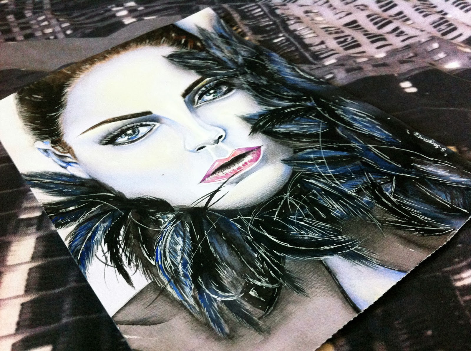
"I can not paint." All throughout my AS course in Graphic Design, I would have a BF over the fact that we were forced to use water colour paints, and not pencils.I am a drawer. I do not get on well with paints. Especially watercolour as I do not have the patience for them.
I never took painting seriously. I would just paint well enough so that it got me a good grade and that's that. There's only around 4 paintings that I have ever taken seriously: My 2 Vogue paintings, my VEGAN painting, and now this painting.
So yes. I have only ever taken 4 paintings seriously - and in each one you can see dramatic improvements.
I began this piece last night, and completed it this morning.
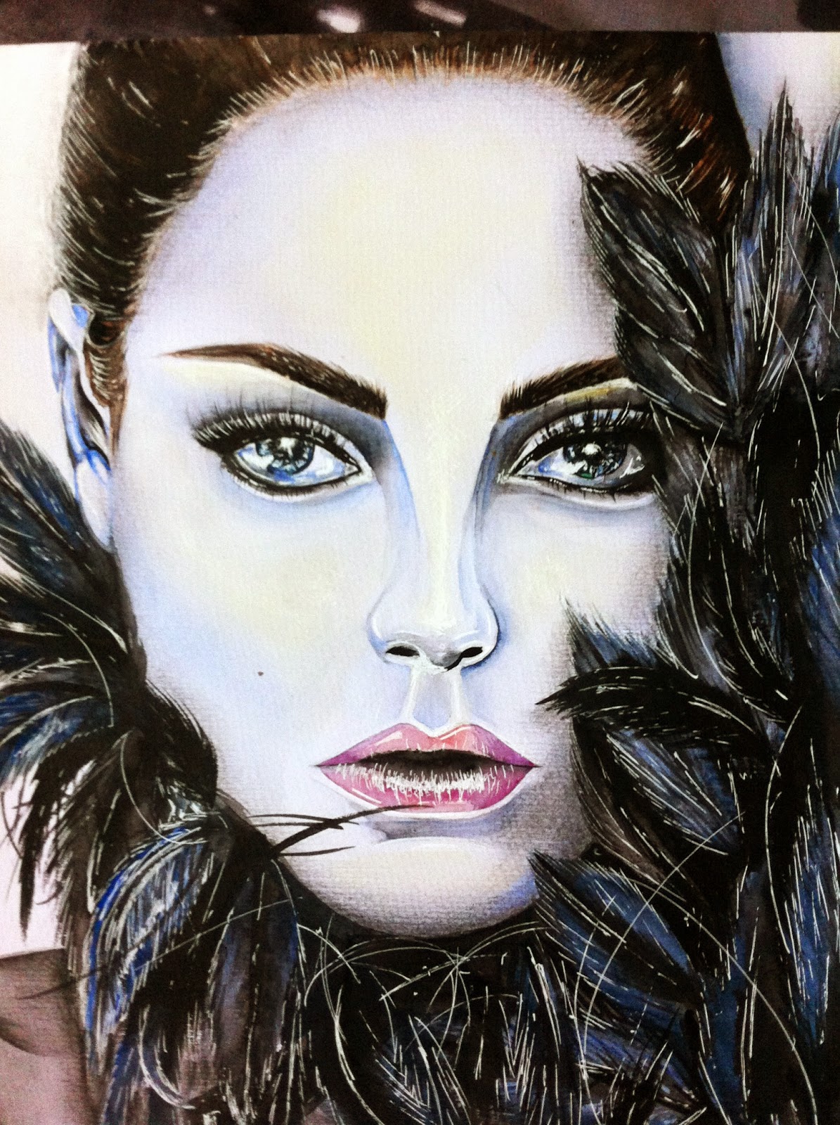
Artwork Name: Mila
Size: 390 x 270mm
Mediums: Winsor and Newton watercolour paints,
Crawford & Black 230gsm Watercolour paper and
Derwent charcoal pencil in dark.
Date created: 13th/14th July 2014
I never took painting seriously. I would just paint well enough so that it got me a good grade and that's that. There's only around 4 paintings that I have ever taken seriously: My 2 Vogue paintings, my VEGAN painting, and now this painting.
So yes. I have only ever taken 4 paintings seriously - and in each one you can see dramatic improvements.
I began this piece last night, and completed it this morning.
I'm lazy and so, I didn't even set up my easel or move my iMac. I just had the A3 watercolour pad hanging off the edge of the desk onto my lap.
Artwork Name: Mila
Size: 390 x 270mm
Mediums: Winsor and Newton watercolour paints,
Crawford & Black 230gsm Watercolour paper and
Derwent charcoal pencil in dark.
Date created: 13th/14th July 2014
Despite all my 'I CAN'T PAINT. I HATE PAINTING' BFs, I'm pretty impressed with how this came out. My 4th ever serious watercolour illustration. Not to mention that the image is a challenging image to begin with - darn feathers! Anyway, here's some more photos - enjoy!
Thursday 10 July 2014
Artis Opus
Hello everyone!
Just thought that I would let you know that the exhibition show was a success! The manager of the venue said that the bar took in an extra couple of thousand pounds more than expected - so that's pretty good, eh?! I managed to hand out a number of business cards; there wasn't really anywhere to prop them near my work like I had hoped, so I just wondered around and when people asked about my work I would force a card in their face!
The exhibition as a whole, was definitely an experience. Myself and 4 other female, art practitioners (who also participated in the exhibition) arrived at the venue at 12 noon on Friday 4th July 2014. From 12 until the start of the show at 7pm, we were setting up the exhibition. In the british, hot, sticky heat, we all trekked a total of 3 minutes to a nearby flat, where we were temporarily storing our work. It took two trips to collect boxes and folders filled with artwork to bring back to the venue. At the venue, we then sorted through our own work - what we wanted to showcase and what we didn't. We all spread out work out on the floor and began to decide how we would arrange the room. We had sheets of fabric which we hung onto the walls using string and wire (this was a tricky task) which we then could attach our work onto for people to walk around.
At the far end of the room we hung translucent black fabric like a curtain across the whole area - this was then the 'Portraits on Paper' section, where work such as my GODFATHER piece and GRANDAUGHTER piece were hung (see above photo, and photos below).
 Directly opposite the 'Portraits on Paper' section, you had my installation piece. As my piece was far too large to transport to the venue, I had to arrange a series of photographs onto the walls. This required preparation as I had to photograph my work, edit the images, select which photos I wanted to use and then choose appropriate paper finishes to best compliment my work when printing - of course I did get help from the photography department. Furthermore, a couple more of my abstract pieces were on display. For some reason my final Abstract piece wasn't at the flat for me to collect as the transportation van didn't pick it up, so I had to make do with two of my supporting pieces which were much smaller, and much less detailed. These were hung from translucent, red sheets of fabric on the middle of the room which were attached to ceiling pieces by thick wire.
Just thought that I would let you know that the exhibition show was a success! The manager of the venue said that the bar took in an extra couple of thousand pounds more than expected - so that's pretty good, eh?! I managed to hand out a number of business cards; there wasn't really anywhere to prop them near my work like I had hoped, so I just wondered around and when people asked about my work I would force a card in their face!
The exhibition as a whole, was definitely an experience. Myself and 4 other female, art practitioners (who also participated in the exhibition) arrived at the venue at 12 noon on Friday 4th July 2014. From 12 until the start of the show at 7pm, we were setting up the exhibition. In the british, hot, sticky heat, we all trekked a total of 3 minutes to a nearby flat, where we were temporarily storing our work. It took two trips to collect boxes and folders filled with artwork to bring back to the venue. At the venue, we then sorted through our own work - what we wanted to showcase and what we didn't. We all spread out work out on the floor and began to decide how we would arrange the room. We had sheets of fabric which we hung onto the walls using string and wire (this was a tricky task) which we then could attach our work onto for people to walk around.
 |
| Stolen from my instagram - Portraits on Paper section. |
At the far end of the room we hung translucent black fabric like a curtain across the whole area - this was then the 'Portraits on Paper' section, where work such as my GODFATHER piece and GRANDAUGHTER piece were hung (see above photo, and photos below).
Adjacent to this 'Portraits on Paper' section, we then had already hung curtains, which were thick and could take the weight of canvas work - this work transitioned from portraits/figures/people to landscapes etc. These were hung by nails being placed into the canvas frame, and then copper wire being wrapped around the nails, around the curtain rail, and then back down to wrap around the other nail. The girls and I played around with the position of the canvases, making some higher and lower than others. Here I had my Vegan fashion illustration mounted on a Vogue newspaper in a frame displayed (sorry, no photographs of this!)
 Directly opposite the 'Portraits on Paper' section, you had my installation piece. As my piece was far too large to transport to the venue, I had to arrange a series of photographs onto the walls. This required preparation as I had to photograph my work, edit the images, select which photos I wanted to use and then choose appropriate paper finishes to best compliment my work when printing - of course I did get help from the photography department. Furthermore, a couple more of my abstract pieces were on display. For some reason my final Abstract piece wasn't at the flat for me to collect as the transportation van didn't pick it up, so I had to make do with two of my supporting pieces which were much smaller, and much less detailed. These were hung from translucent, red sheets of fabric on the middle of the room which were attached to ceiling pieces by thick wire.
As I said, overall the whole night was a success and thoroughly enjoyed myself! Of course, there was a bar downstairs so I had enough shots throughout the night to keep me awake and socialising! Thank you to every one who attended and I hope you enjoyed the evening as much as I did!
Tuesday 1 July 2014
LG by S.Sargeant advertisement
As a designer for Logan Garments, I came across one of their sponsorship videos, with their talent, Dan Thomerson, wearing one of my shirt designs whilst performing his talent.
The video clips belong to Luke HoneywoodHD as it is not my footage, however I have cropped the clips relevant to my design and added an outro graphic so that I can share it with you all!
Here's line to the orignal video by Luke HoneywoodHD: https://www.youtube.com/watch?v=EqUnK... of Dan 'Aussie' Thomerson for Logan Garments promo.
Subscribe to:
Posts (Atom)


