Monday 26 March 2018

Disembark

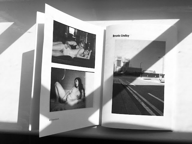
Following the States of Europe project, designing a newspaper showcasing some work from the BA Photography students, the Programme Leader and Principle Lecturer at the school of Architecture and Visual Arts asked me to design the BA Photography graduating catalogue which will be distributed during their graduating showcase, Freerange.

During the breifing with the final year students, we established that there would be aprox. 25 students, with around 4 pieces of work to showcase, plus a small amount of text. After looking at exisiting book binding examples, the students voiced that they would like the kettle stitch binding to be exposed on the spine, with no hardback cover; each student would also like to have their own signtaure, so that it feels almost like a 'book within a book'. As for materials, I provided a GF Smith sample book, and we chose Gmund Action paper in Electric Blood.


Following the meeting, I established a draft design, so that we had a PDF that could be supplied to both the paper [GF Smith] and the print company [Hill and Garwood]. As the design would need to be very minimal in order to showcase the photographic images, I decided that the communication and 'design' of the catalogue would be through the final production and the typography. I decided to use Bureau Grotesque for the headers, as I wanted something quite bold and to emulate the effect of organic, letterpressed type. For the body, I needed something readable, as the final catalogue size would be A6 (1. to keep down costs and 2. an A6 catalogue is nice and pocket sized plus it would have more of a thicker feel in relation to the overall size), then it would mean the pt size would have to be fairly small. I chose Avenir Book, as the humanist sans-serif font is contemporary (to contrast the heading type) and is also clear at any pt size. Avenir Bold and Italics have been used for creating a hierachy within the body text.


As each student would like their own siganture, I opted for a 4pp binding with the exposed stitching, so that each student would commence on the verso and end on the recto, with a spread in the centre. There would be a 'title page' for each student, showcasing one of their images and their name, while the spread houses the Project Title, body text and also the photographers website. Opposite that would be some more images, and once again on the 'back'. The design would repeat this way for each student, with the exception of one student. There was one project which did not follow this format, as the photographs are overlayed with text and are horizontal - I was advised that they did not want any images to be rotated. Due to this, it means the images would be printed smaller than A7, rendering the text too small to read. As a solution to this, I am playing with the option of having a fold out page, so that the images can be full bleed on an a6 spread fold out, or across the middle page. The result depends on the budget and quote from the print and paper company, as we are requesting a run of over 700 copies.


For the paper stock, as the main focus of the catalogue is the photography, I opted for coated paper as I wanted a silk finish. Gloss would have reflected too much light and would interfier with the readbility of the text and also the full view of the images, while uncoated paper would have made the images less vibrant and would read differently to the photographer's intentions. As we are hoping to have GF Smith sponsor the catalogue, I was limited for paper options. The closest stock to what I was looking for was PhoeniXmotion, so I have selected this for the internal paper, in the colour Xanur as I didn't want a bright white. I wanted to look of the paper to be more subtle and not so blinding. For the cover, I have requested a quote for Gmund Bier Wiezer and Chevreau Cult. I wanted something with some texture and an uncoated feel to juxtapose the internal design and to complement the industrial feel of the exposed stitching. Keeping the cover sleek, the Disembark logo that I designed will be debossed on the cover, with a clear foil to emphasise texture and rawness with a sleek and elegant finish.

Gmund Bier Wiezen
Chevreau Cult


Disembark: Photography Auction

After being asked to design the Disembark catalogue for the final year BA Photography students, I was also in charge of designing all of the marketing/advertising material for their Disembark auction. The auction took place at Shortwave Cafe near Bermondsey in Central London, in order to raise funds for the production of the 700+ catalogue run.

The original paper stock for the catalogue cover, as chosen by the photographers with my support, was to be GF Smith's Gmund Action in Electric Blood. The paper is an intensely vibrant pink-toned red, with light reflecting particles - but I later found out that it's GF Smiths most expensive paper, as it's made of crystals. Due to the possibility that this paper stock could be out of budget (subject to the fundraiser), I had to think of an alternative.

For the auction, I decided to keep a level of consistency across the catalogue design and the advertising for the catalogue auction. As the Electric Blood shade seemed to be the core of the Disembark design, I decided to emulate the shade as close as possible, using CMYK (we did not have a budget for the flyers/posters/invites so I had to improvise on keeping the design as cheap as possible).

The typography used for the designs include Bureau Grotesque [for the headers], Avenir Book [for the main body], and Avenir Bold [for creating a hierarchy within the body text]. These all worked well together for readability, compatibility and also aesthetics. Avenir was perfect for the smaller pt size used for the invites, but also the large pt size for the A2 posters while being contemporary and smooth.

As we were printing the background, rather than using coloured paper stock, I was able to add pops of white to really add a contrast to the design and make fundamental information advance from the prints.


Sunday 25 March 2018

Sprint Finish: Technofen

When I was a child during the summer I would play in the garden, giving my nan a heart attack as I zoomed down the slide and performed cartwheels, and would make my face bright red from balancing on my head for far too long. In the evenings I attended dance class and during the weekends I would be at my horse riding lessons, so I was a physically active child (and actually a pretty busy). Now and then, I would play on my PlayStation 1, often with my mum, and play the old skull games like Pandemonium, Abes Odessey and Croc - just to name a few. 


Moderation in everything is necessary - chocolate needs to be consumed in moderation; even water needs to be consumed in moderation. Technology isn’t any different. However, it’s now 2018 and we currently live in an Age where the evolution rate of technology is rapid, and the digital world is fascinating, convenient and fun. However, it can also be dangerous. 

From first-hand experience with my 3-year-old brother, I know the convenience and simpleness of handing an infant/child an iPhone with YouTube Kids pre-loaded (who knew that watching play-doh could be so addictive?!). It's an easy way to calm any oncoming tantrums, encourage them to eat their dinner, or to distract them while out in public - just to avoid a scene. Kids love it. This world of having what you want at your fingertips and loaded in an instant is everyone’s dream, and children in 2018 are living that dream - however, some psychological issues can evolve if the technology isn’t consumed like everything should be - in moderation. 

This convenience and ease of technology is replacing physical activities including playing over the park, joining a sports team/class and even interacting with physical objects other than a screen. This lack of physical communication, touch and play, changes neurological pathways in children as it creates new ones. This rewiring of the brain affects concentration, self-esteem and the ability to form deep personal relationships. The lack of hands-on activities affects the development of sensorimotor and visual-motor skills while the ‘addiction’ to technology fails to teach children empathy, moderation, impulse control or how to challenge themselves. Necessary communication skills are at risk and social anxiety, diabetes, obesity (resulting in early stroke and heart attack) could potentially form. 

As a response to this idea, I have created a dystopian future, where future generations are allowing their children to be consumed by the evolving world of technology and are artificially supplying their children with the skills in which over-consumption of technology causes them to lack - through medication. By designing a tongue-in-cheek medicinal packaging (called Technofen) that spoofs the idea of medicating children, rather than limiting their exposure to technology and encouraging physical play I am exposing the dangers that technology can have on children. 

The typeface that I have utilised for the Technofen packaging is Frutiger, a humanist sans-serif typeface. The reason for this font selection is that I wanted to emulate the aesthetics of NHS branding - to some extent, while also having a contemporary feel. Using existing medicine packaging as an inspiration, I included all of the essential information, such as age/dosage, expiry date, batch number and other fine details. By paying attention to crucial but over-looked details I was able to create a clear design that communicates pharmaceuticals. The colour scheme was kept minimal, with black text against white, for a contrasting and contemporary/minimalist feel (as I am designing for the future) with each product having one assigned colour. These colours are pastel shades as I am branding these products for children, but marketing them at adults; thus I wanted to use colours that are associated with babies (such as baby pink, blue, yellow) but giving them a mature twist. The packaging has been displayed in clinical, light up display boxes in order to echo the detached and cold medicinal/technological world. Using human figures 1:25 scale gives the packaging some context of being large objects in an exhibition space (I did try to physically build life-size versions, but ability, budget and deadlines rendered this to be close to impossible). 

To accompany the packaging, I have produced large prints of the packaging to be displayed as a series, so that spectators can get a feel of the scale (if they had been produced as full-size versions) and so they read the information easily and not in a smaller pt size, as the copy an important aspect of the design. Additional information documents have been printed that follow the Technofen branding but from the opposite spectrum, where it is more clear that technology is inputting some skills and also subtracting some. I have communicated this through the use of HTML code as the body copy of the design, using <del> </del> and <ins> </ins> to communicate the alteration of basic skills (in addition, 404 error not found). By using computer vernacular, it aims this product at the correct audience - those who are entirely consumed by the computer/technological world and should be aware of the dangers of overuse in children. 

The overall message of the project is to make spectators aware of the neurological effects of technology and that children should just go out and physically play, as regularly as they engage with computers in order to ensure that basic skills are developed.

Images to follow.