Friday 16 January 2015

A fashion adaptation of Stanley Kubrick's 'A Clockwork Orange'


'A Clockwork Orange' is a controversial and a very juxtapositional piece; Alex (the teen protagonist) is a primal savage - a civilised, primal savage who's interests extends to art, Beethoven, rape, violence, and murder. Following my perception and research of the film, I believe that the overall conclusion to the film is the conflict of two minds: the intellectual creative side of man, vs. the primal side. We clearly see this conflict in the scene where Alex chooses to defend himself against a Beethoven bust statue, with a phallic object; this emphasises the idea of the mind vs. the body.

As a designer who relishes particularly in fashion illustrations I have decided to approach this theme through fashion. My theoretical adaptation of Kubrick's 'A Clockwork Orange' will be that all of the characters are costumed in theatrical, haute-couture fashion, possibly inspired by Jean-Paul Gaultier and Alexander McQueen. Fashion has always been considered a depiction of someones status and wealth - particularly obvious
in the 1600's where fabrics, dyes and embellishments along with choice of garments would depict such things. Thus relating to the theme of the film, fashion would equal the creative, intellectual, cultured side of the brain. However, I will contrast this by using 'Savage-Beauty' and very theatrical, anarchist makeup/fashion accessories to bring out the primitive, primal side.

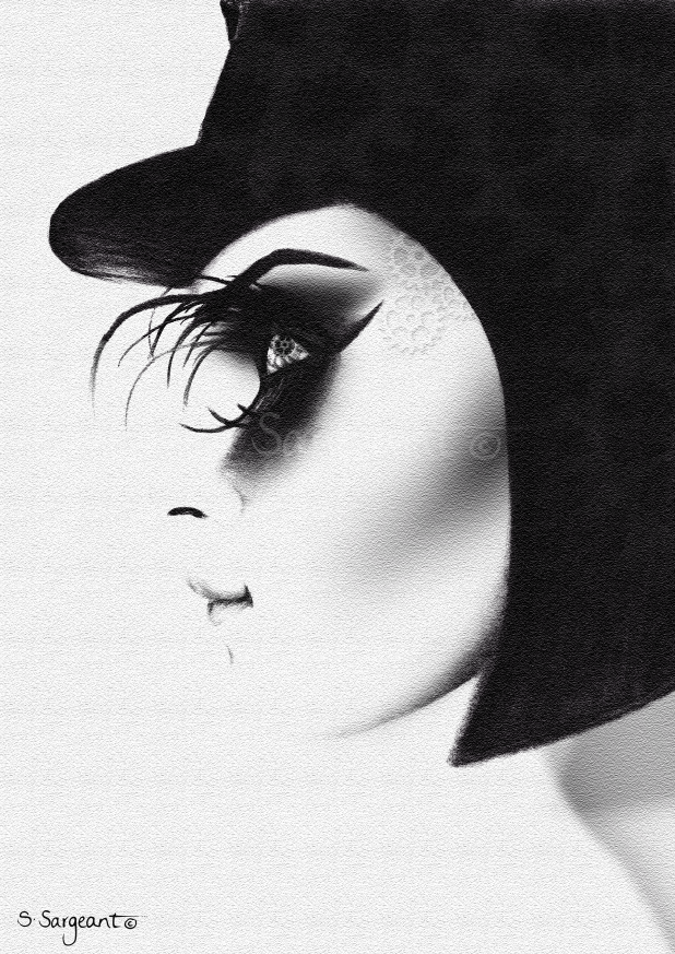
Charcoal on paper and photoshop. Visual demonstration of my idea.
I decided to reverse the gender within the film, to see how it would affect the meaning and perception of the footage, as many feminists have disputed the film's content to say that it has acts of misogyny.

Also I feel that in contemporary fashion, females are a typically commercial way to sell fashion and beauty, and thus may attract more of an audience to the film.

When thinking of the visuals of this campaign, images such as Black Swan come to mind, Alexander McQueen, Jean-Paul Gaultier, theatrical makeup, high fashion. In terms of visual communication, I imagine high-contrast, black and white images possibly with hints of orange just to add a pop of colour and to also tie back to the title 'A Clockwork Orange'. The fashion will be steam-punk due to the use of cogs and gears, with an anarchist vibe.


Wednesday 7 January 2015

Pocket Monet

For my most recent brief at University of the Arts London, London College of Communication, I was required to create a pocket-sized 'something' which represents researched information about our elected personnel. The name that I popped out of the envelope was Lord Baden-Powell. This is what I came up with...


After days of extensive research, I understood that Lord Baden-Powell was a member of the British Army and founder of the Scout Movement. Due to this, his sister then ran the Girl Guides Movement. An interesting part of my research, was that Lord Baden-Powell (L. B-P) was arguably a repressed homosexual. I discovered this information primarily from my Grandad, who seems to know something about everything, and then backed up this finding by reading journals, such as 'Lord Baden-Powell' by 'Tim Jeal'. The text quotes that "Baden-Powell was in a position of public trust which made watching, at one remove, almost the only way for him to satisfy his interest" (page 96), "The available evidence point inexorably to the conclusion that Baden-Powell was a repressed homosexual" (page 103). Following this finding, I then decided that I would like to design a Scouts Badge (fabric patch) which celebrates acceptance of everyone's sexuality - thus, an award for 'Love and Humanism'.

Of course I researched existing products to inform myself of composition, colour schemes, size etc. I also looked into Gilbert Baker - the designer and creator of the LGTB Rainbow Flag, and soon discovered the 'Pink Triangle', the second most popular and recognisable symbol for Gay Rights (second to the Rainbow Flag). The Pink Triangle was originally used in Nazi concentration camps as a way of categorising and identifying homosexuals. During this time and for this purpose, the triangle was actually a down-facing pink triangle, and thus has now been reversed to an up-facing triangle, to give the symbol a positive meaning supporting Gay Rights. A Pink Triangle surrounded by a green circle stands for alliance with homosexuals, and a space free from homophobia. 


So I knew that my design would have a Pink Triangle, surrounded by a green circle; would contain the phrase "Principle and Practice of Love and Humanism" (later condensed to "Love and Humanism") and also the Scout Movement symbol.
After visiting Lord Baden-Powell House in South Kensington, London, I discovered his signature and also a statue of his appearance. Using this, I illustrated his portrait using a permanent marker and Adobe Illustrator and copied his signature. 


After playing around with composition and having the layout that I was happy with, I decided to adjust the colours. I opted for a Khaki colour scheme to reflect Scouts, using earthy tones of green, beige and brows, along with the hot pink shade for the Pink Triangle. In terms of finalising the product, I had hoped to have the badge embroidered. However as I wanted the size to be 5cm x 5cm the company informed me that my design was 'too complicated' and so that size would not be suitable. Also the shades would have to be altered as they couldn't stitch the colours of my original design. As an alternative, I used Heat-Transfer to transfer my design onto canvas fabric re-used from my unwanted tote bag (very Scout-Like/Brownie-like of me!).
Overall I am happy with the design. There are small elements which make it more appropriate to my idea, such as the adaptation I made of the scout emblem (I changed the stars on the fleur-de-lis to Lesbian and Gay symbols) and I feel that the colour scheme worked well as the Pink Triangle advances from the Khaki shades. I am also happy with how the portrait resulted and also the overall composition. I would have liked to have played around with some old fonts that were commonly used during L. B-P's life time and of course would have preferred an embroidered product. However I feel that this piece reflects L. B-P well, as a repressed homosexual Scout-Movement-founder which of course was the purpose of my brief. Oh, and it fits in my pocket at 5cm x 5cm!


Thursday 1 January 2015


Just before Christmas a number of clients asked for personal artworks as a unique present for themselves, or for a loved one. Here are a few shots taken of a couple of my Christmas projects.
I apologise for the unprofessional photographs, having such a quick turn around time, I didn't have anything more appropriate at hand, other than my iPhone 4. Hopefully you'll still be able to get a good idea of the drawing outcomes. If you would like any artwork created, personal or business, please do contact me!


Progress shots: