Monday, 13 March 2017

D Factor design concept

UK garage originated in the early 1990’s as a genre of electronic music; and was a music scene that existed during my childhood. As I was born during the peak of garage, in 1995, I decided to create a garage track using samples, as I wanted to create music inspired by sounds that I appreciate and that would be suitable to be transferred onto a vinyl record (anything that hints more towards pop-culture would have been too modern for it’s purpose). I particularly enjoy Urban music, and so I wanted to follow that, as I appreciate the multi-cultural influences.

In order to make my track recognisable as garage, I used distinctive percussive rhythm, hi-hats and snares - I did also include some beat-skipping kick drums. In order to be entirely truthful to my genre, I incorporated a commonly used feature within garage, pitch-shifted vocal samples that complement the rhythmic structure. 

In order to create this track, I wanted to use DJ style software, as though it was a track being constructed in an underground club in London, there and then. As the 90’s saw the emerge of technology I wanted to use software that exists due to this evolution; thus I decided that I wanted to use an app as opposed to other music production methods. My 2.5 year old brother actually showed me a music making app that he had on his iPad called, LaunchPad. I decided that I wanted to use this, as it was exactly what I was seeking; as you have a selection of samples that you must activate or deactivate while you record the whole track, live. 

I think it’s interesting that in contemporary cultures toddlers now have advanced technological knowledge in comparison to past generations. I wanted to incorporate this ideology within my work, by using the app that is on my toddler-brothers iPad, that he can utilise and actually taught to me. 

Issues that I would like to explore within my design of the record cover and music video include: multi-culturalism, children and technology. I may also like to include nostalgic links between the 90’s and present day, and the London underground scene. 

Link to my song: https://youtu.be/E8oSm1bkcIU


Update:


Hand cut stencil used to hand emboss 300gsm black card


Tuesday, 7 March 2017

Sending Out a Flare to Dr. Martens


Kayleigh and I began our line of communication with Damien Wilson (Creative Director) from Dr. Martens, as we wanted to attract his attention in order to encourage him or his creative team to give a talk at University of East London. 

Inspirations also included Allen Jones
We began by researching his background, in which we discovered that he was a teenager during the 1980’s, a time where Punk and other sub-cultures were thriving in England. This influences his work at Dr. Martens, as the heart of the brand and himself is music, rebellion and youth; thus he still reflects back on his 80’s youth. Dr. Martens market themselves at nonconformists, British subcultures, and focus on individuality, anti-establishment and vintage-heritage; while they began by supplying for working class members such as postmen who needed affordable, comfortable footwear. 


I wanted to harness all of these traits in order to create my final piece/flare. As the brand focusses on footwear, I didn’t want to supply Wilson with a foot, thus I wanted to supply him with the next best thing - a leg. Alexander McQueen (someone who I often turn to for punk inspiration) once said “I find beauty in the grotesque, like most artists” and this was something that inspired me, as realistically, a single, unattached leg spikes thoughts of endless possibilities for why the leg has been severed from the body, often making the conclusions quite grotesque. However, by styling these legs, we have ‘beautified’ the grotesque with the use of embellished materials that are often linked with British subcultures. I myself focussed more on glam punk, while Kayleigh explored a more vibrant, flamboyant subculture. 

I had to source the materials most suitable for the subculture and music genre that I was responding too, and also keep my eye on the budget as the heart of the brand stemmed from the working class - not to mention, the punks kickstarted the DIY movement and so I wanted to create something quite thrifty and unique. 

Once the legs had been completed we failed to source a box that would accommodate the two legs for postage, so we had to think of an alternative. I photographed my leg in various positions, hanging from a chain lead, in an almost bondage style. I tried making the leg appear as though it was pushing through the wall in a weird psychedelic, warped world in order to give it a strange personality. The images that I found most aesthetically interesting were the abstracted images where I focused on close ups. These images make the spectator intrigued, and provokes thinking and problem solving, while also showcasing the variety of textures used throughout the leg styling. 


As I am taking inspiration from 1970/80’s British subcultures I wanted the photographs to reflect that period. I explored taking the photographs with and without flash, and soon discovered that the flash photography enhanced the reflective fibres within some of the materials, giving a grainier, grungier appearance. The white backgrounds also transformed to dark grey/black due to the camera focussing on the visual merchandise. These images didn’t require retouching. Once I imported them into photoshop the images looked just how I would have liked and I was thrilled about this, as back in to 70/80’s raw images were often used within the punk industry to expose the truth, as the movement had a political ideology that focussed on expression and being open. I did however, reduce the resolution slightly and add a grainy texture in order to remove the perfection from modern, 2017, technology. 


I printed these images on 4” x 6” photo paper, as once again I wanted to simulate the era through the nostalgia of photographic prints as traditional photographs. My printer has a slight collaboration issue, where the photos printed with a green tint. Even though this was unintentional, I decided to utilise this as a feature instead of reprinting, as I liked the vintage quality it gave to the image, as well as the imperfection and hint towards steam punk. 


My photography

Kayleigh was happy with these images, so she photographed some un-staged close ups of her more flamboyant leg, for me to edit and print in the same way in order to keep consistency. I like how her images were un-staged, and there is more truth and purity to her images, while mine were more referenced towards the DIY movement by setting up my own scene in a makeshift environment. Both are suitable to the brief and work well together.


Kayleigh's images, with my editing

Finally, we had to solve the issue of postage. What were we going to post the photographs in? Kayleigh suggested redesigning a sleek, and modern box that she obtained from designer store, Choice. I liked this idea at first, but upon further thought realised that it was appealing more to our own style, rather than towards Damien Wilson, Dr. Martens or the British subcultures. The design would be too perfected and neat for our intentions. I decided to take a risk. I thought of just throwing the photographs in an envelope and being entirely direct and completely ‘punk’, however Kayleigh opposed dramatically of this idea, so I had no choice but to convince her. 

I made a prototype using A4 paper to throw together my own ‘envelope’, sealing it on the back with thick, black gaffa tape, a hand made label and a touch of yellow thread as a response to Dr. Martens branding. I convinced Kayleigh by sending over the images along with the following passage: “Punk is all about the DIY (do it yourself) movement, and going against rules and what ‘should’ be done. So essentially, throwing everything that we SHOULD be as designers away, and doing what we shouldn’t be doing, or what goes against conventional design methods. The photos are professional quality, so he [Damien Wilson] will know we are not being lazy. And he understands the alternative movement so he should find this refreshing. A sleek modern box is great - totally our style, but is it his? We need to design for the movement, the theme and the brand; not our own personal aesthetic. Hence why I think this is stronger. The point is to be risky and do something out of our comfort zone. A hand made envelope does that. We can print the address label on the photo paper too so it still has that luxury quality to it and then the post office will add a stamp to it to give it even more character”


Kayleigh still needed further convincing, so I allowed her to experiment with the Choice box, while I compromised with my DIY-envelope by making it feel more durable and luxury. Just by increasing the paper weight, and printing the label on photo paper rather than ordinary copier paper made the design more crisp, while the slapped-together movement accompanied with the industrial gaffa tape grounds it back to my initial intentions. As a result, the box redesign didn’t work out too well, as so we posted the photographs in the designed un-designed DIY envelope. 


Overall, I am happy with the project as it helped me to rethink design, by unthinking it. I had to do what designers are told we shouldn’t do, such as using a mobile phone for photographs instead of a modern DSLR, packaging our raw photographs in a hand made, messy envelope and also throwing a load of materials on a single body part in a totally free, and unplanned process. Of course, this was all intentional in order to aid the aesthetic and aim, but it helped to open my mind from the rules and constraints of the design industry.


As an update: We decided to include an invitation within the envelope too invite Damien to give a lecture at our university, UEL. We hope to hear from him shortly! 


Rethink

As a solution to the current Refugee Crisis many have suggested that we provide the victims with their own country; this idea has been disapproved as critics say that it’s based on exclusivity. I would like to revisit this idea, as personally, I feel that exclusivity is less of an issue than discrimination that they face in other countries, and murder and suffering that they face in their own. 

My creative response, inspired by Jenny Holzer
I started by researching the least populated locations. Of course this predominantly included deserts; thus my first question was “how could we make the climate and drought in the Australian Outback and/or Namibia habitable for humans?”. 

Another possibility is Pitcairn Island, owned by the British, but in close proximity to New Zealand. Currently, to live on Pitcairn Island it’s calculated to cost and average of $9,464 annually, with an income of $6,000 a year, vs. the current costs now which is $12,874 a year per refugee. We can also improve homelessness by giving homeless people and unemployed people the opportunity to move here. They can build the environment to accommodate more stores, schools, homes etc.

New York is one of the most densely populated (if not the most) location with 8,550,405 (8.5million) people in 789 km². In order to calculate how people people live in 1km² of NYC (the population density) I divided the population by the size of the area, thus, there are 10,837 people per km² in NYC. If we were to house the refugees on Pitcairn Island and allow it to be as densely populated as NYC (knowing that this is possible) I calculated the possible population density of the Island. As there are there are 10,837 people per km² in NYC, we can times 10,837 people per km² for the Pitcairn island which equals 509339 (5 hundred and 9 thousand 3 hundred and 39) people; thus 509339 (5 hundred and 9 thousand 3 hundred and 39) people can inhabit the Pitcairn Island if populated like NYC. “Record 65 million people forced to flee homes, UN says” That leaves us with an outstanding four million four hundred ninety thousand six hundred sixty-one refugees to house, so this Island doesn’t completely solve the issue. 

The least densely populated location in the world is Greenland; thus if we apply to above calculations we come to the conclusion that Greenland can house: 21674000000 refugees. Thus 21 billion 6hundred and 74million people can inhabit Greenland alone if populated like NYC. Greenland can accommodate the 65million refugees easily. They can set up their own community there and people who are unemployed/homeless can also go to Greenland and help build the community: housing, schools etc. Young people can volunteer to help, which builds their CV, and employability, including cheap housing. 

Greenland is the worlds largest non-continental Island but 3/4 is covered by permanent ice sheet. So if we calculate the 1/4 that isn’t covered with ice (500000 x 10,837 = 5418500000) 5 billion 4hundred and 18million 5 hundred-thousand can inhabit Greenland (avoiding the ice) if populated like NYC.

There is no issue in Greenland for agriculture, as Southern Greenland thrives with farms and luxuriant vegetables. “The sea is rich in fish and invertebrates, especially in the milder West Greenland Current” as “Approximately 225 species of fish are known from the waters surrounding Greenland, and the fishing industry is a major part of Greenland's economy, accounting for approximately the majority of the country's total exports.” Greenland also provides more jobs as the Island is abundant in minerals and ruby deposits began in 2007. Other minerals that can be extracted from Greenland include iron, uranium, aluminium, nickel, platinum, tungsten, titanium, and copper.”


On average, each Middle Eastern refugee resettled in the United States costs an estimated $12,874 per year per refugee, therefore It currently costs $836810000,000 (8hundred 36billion 8hundred and 10 million) a year on all the refugees. Thus, that money can be put into Greenland to cover the costs of building, wages etc. Every country can chip in to this fee, so that it’s a worldly effort in order to assist those in need. It will encourage the refugees to work and will also give them a safe place to inhabit. By giving the refugees a choice we are not subjecting them to exclusivity, and by Greenland being able to actually house more than the whole population of humans on Earth, anyone could be welcome to live there; so exclusivity is a minimal issue. 

Update:


Inspired by Richard Mosse's Exhibition at Barbican 


Wednesday, 1 March 2017

Everyday Objects

As a starting point, we acknowledged that communication is key for a sucessful collaboration. Kayleigh and I discussed our strengths and weaknesses, and found a common theme: our illustrative style. We felt that we wanted to abstract the products, by stripping them back to their minimalist form and exhibiting the elements that speaks for the product itself. 

We began by collecting the following information from each product: it’s shape, typeface, atmospheric aura and it’s colour scheme; as we felt that when these elements were combined for each product, we could communicate the items through their iconic signs, rather than indexical imagery. Sticking to the abstracted, minimalist ideology, we extracted only one letter from each product’s title to be the foreground of our designs. The characters that we chose were thoughtfully selected: for example, the K from Pukka has a decorative design blooming from the character, making it identifiable even when removed from its context. Some were not as straightforward as this, and we selected them due to composition: did we we want the y-axis of the ‘t’ or the x-axis of an ‘M’? Would an uppercase or lowercase letter work best within this space? And did we have a good variety of letters? 

Using our combined illustrative skills and styles as an advantage, Kayleigh and I wanted to capture the mood, texture and/or function of the product by producing hand rendered backgrounds. Here we focussed on pattern making, colour schemes, composition as well as diversity. Each product has its own unique design that reflects itself in an abstracted, reduced form. 
As we have a diverse illustrative skill set, no two pieces are the same. To create our designs we focussed on pencil drawings, pen illustrations, digital art, paintings and lenses based imagery; thus we were able to experiment with a variety of techniques, each being applicable to the product.

Due to our separate styles, our designs have a nice juxtaposition while complimenting each other. For example, Kayleigh’s designs are busier with more bold colours, while my own are more reductive and minimalist. Aesthetically these work well together and there is a great balance of the two. 

Taking inspiration from the product ‘EMILY CRISPS’ we used didot as the header for our essay designs. Originally we used this type for the body too, but felt it’s wasn’t legible enough once we printed a test. We definitely wanted a didone style typeface with the medium contrast between thick and thin, thus we selected Baskerville for the body. Once printed there was no issue with the legibility.

As a printed catalogue felt too mundane for our ‘abstracted’ pieces, we decided the we would like to suspend our designs from the ceiling. We sourced a long, sleek corridor to help enhance our designs and opted to hang the pieces in the centre, one design behind the other. This way, we are still providing the spectators with the mystery of turning a page, but by making them walk past each design. 
By suspending the pieces in the centre of the corridor we are being shouty, a nuisance and unavoidable: the elements of advertising in this consumerist environment. 

As there are layers to our designs, we wanted to play on this rather than creating flat 2D designs. We printed the characters on a sheet of acetate (as a more budget-friendly alternative to glass) and hung these just before the backgrounds, making the distance between the foreground and background provide a 3D illusion. 

Update:
We decided to develop our idea further and create a complimenting catalogue also.


Sunday, 26 February 2017

Alter Ego

Myself admiring work in the AMNH
I have always felt the pull between Science and Art; in particular biology. When I was studying for my GCSE’s I discovered by academic ability and my interest of a career in biology. However, my love for creating was larger than my love for research, and thus, I didn’t want to dismiss that part of me. Following a career in art allows me to delve into science, be creative and to research; therefore I do not doubt my current path. However I do often question the ‘what if’s, and so my alter ego is me, perhaps in an alternative universe, where I followed my scientific path. 


I began by giving my alter ego a different upbringing. One where she (I) would be exposed the the world of life and science as opposed to my life, which in reality made me feel more doubtful of my abilities, and also the paranoia of either failing or being isolated from others around me, due to have an over ambitious dream that it’s unconventional from the mundane day to day life of my surroundings.

At the time, art seemed to be more achievable for me personally, as it was a subject where my abilities were evident and no one would question; where as science was a field where I felt that I always had to prove myself, despite my intellect. Being a female from Essex made me have to prove that I had my own brain, as opposed to it being an accepted that everyone is ‘smart’ unless proven otherwise. 


However, my alter ego had not been faced with these challenges. She (I) grew up in South Africa, out
 in the veld, further from the rules and prejudice of society. Her (my) mum was healthy, with no disabilities or dependance on me, and lived her dream life of being an interior designer for upper class families while her (my) dad actually existed, as a South African veterinary surgeon (my mum in real life was ecstatic to hear this!). Due to her (my) dad having a biological background in animal biology it would enable the science pull to be much greater, as it would feel more achievable. 

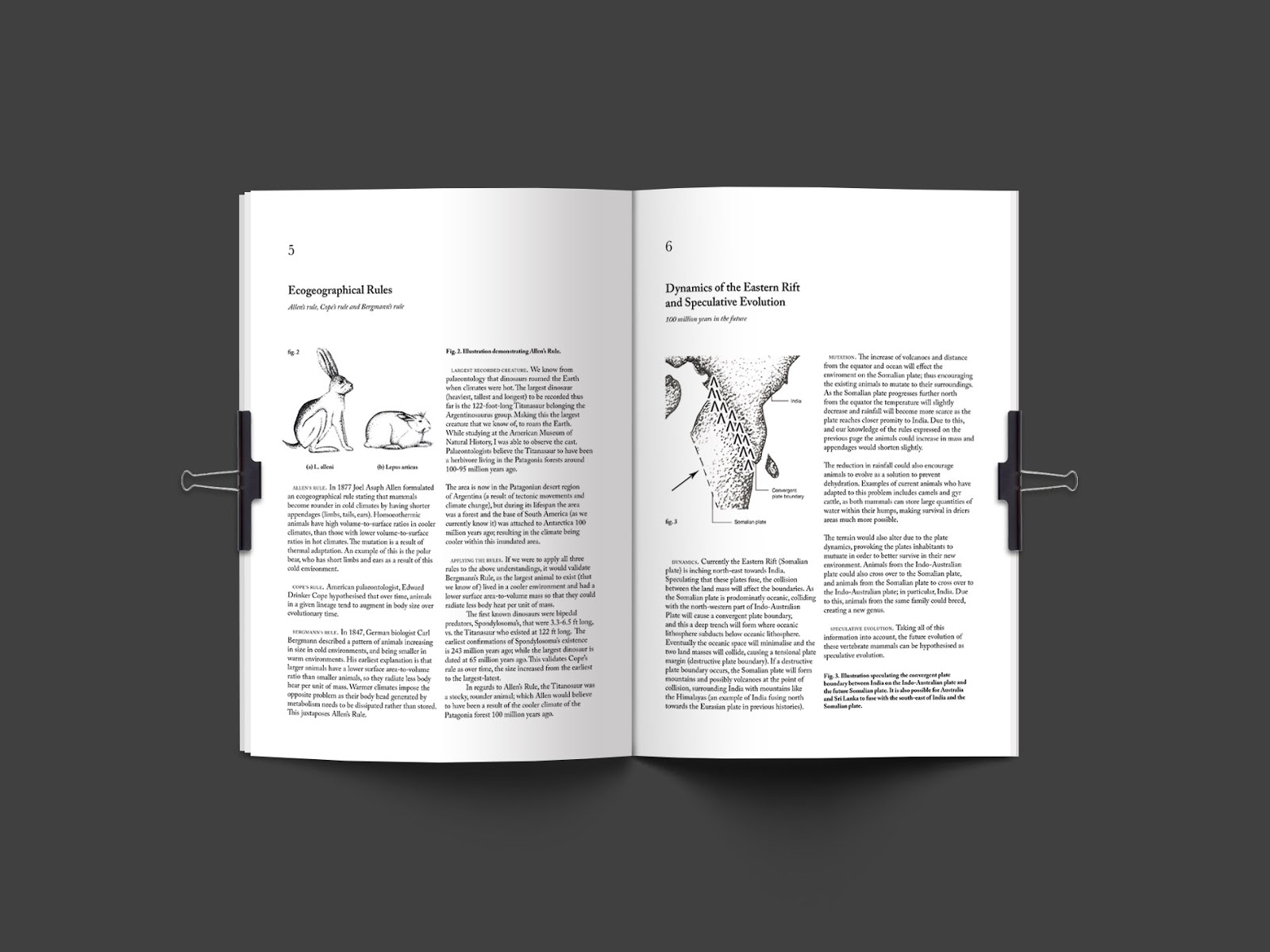
“I, Sophia Sargeant, the vertebrate zoologist specialising in mammalogy, have connections with the science department at UCL (and thus the Grant Museum of Zoology) and am currently on assignment at the American Museum of Natural History. I am using the specimens and facilities accessible to me, to my advantage in order to hypothesise the speculative evolution of mammals as a response to the tectonic plate dynamics and climate alteration. 


I have accumulated valid research from palaeontologists, geologists and climatologists in order to credit my theories. In order to help other researchers within my field I have published a research journal with American Museum of Natural History Publications under my sponsors, UCL. Accompanying this research, I have utilised my illustration skills (influenced by my mum career of interior design) to provide a more visual understanding of my findings. 

As a media marketing tactic, my sponsors at UCL have invited me to share my knowledge and research with some of their students at the Grant Museum of Zoology. This conference/lecture has been approved and funded by the American Museum of Natural History as a support to influencing and encouraging other students and researchers.

As I travel between London, New York and South Africa, many people are interested in my works, and thus I am aware that not everyone who would like to would be in attendance at my conference, therefore as a twenty-something female myself, I have utilised the youth culture to my advantage; and so I have shared the audio from my conference on Spotify so as to not limit knowledge. I want knowledge to be accessible everywhere and I am using my impressive age as an advantage and an edge, as opposed to ‘immaturity’ or ‘inexperience’. “

Back to Sophia Sargeant, the designer: I initially intended to print my research as a traditional, 18th century scientific research journal, with scientific illustrations, as I feel like science is quite a traditional subject. However upon further thought, I decided against this, as I am speculating the future, and thus my designs should reflect futuristic minimalism with no elaborate gold foil, just minimalist, reductive and straight to the point with no ‘waffle’. I am also using my age as an advantage within this field, and not a cause for others to de-credit me, therefore the works that I product should be fresh and modern to reflect that aspect of my personality. 

Referencing existing mammalogy and scientific books from the library, I settled on a serif-type as I did still want the aesthetic of a research journal, but with a modern twist. I chose Caslon typeface for it’s old-style classification and also to hint back to the 18th century, and its traditional English feel, as ‘I’ am working with UCL Grant Museum of Zoology. 

Often, if the traditional science books, Italics and Bold styles are often used. I applied the same rules to my own journal, to categorise information and to help make it more digestible and distinguished. Aesthetically, it also helped the type to be true to it’s scientific content. 

I selected books that included scientific illustrations as this was something that I knew I wanted to incorporate from the start, in order to bring myself and my alter ego together. Using these as inspiration, I demonstrated a lot of my research/essays using illustrative ‘figures’ to help the understanding of the dense information, and to also emphasise the graphic content and reference of 18th century research. 

Alignment and composition of text altered depending on the published date of the books, and also the dimensions. If the books were smaller, text would often run from the left to the right (like a novel) with no columns while larger books demonstrated columns. When I originally intended to produce a traditional book, I considered using smaller dimensions with the text running on full lines; however when I opted for a more modern approach, I decided that I would print on A4 paper in order to be truthful, upfront and direct. Thus, I used columns to structure my dense texts as I wanted the information to be more digestible. By using columns it’s more true to my time period, as magazines and modern medias use more narrow widths for their sentences and often columns. To also make the text easier to absorb, my ‘essays’ are divided in chapters, that do not span over a single page. Making the information quite direct. 

As a test, I printed the journal on standard A4 copier paper; however the bold typography and darker elements such as biological finger prints (which are my own, to emphasise my identity and relationship with biology) were visible when printed on both sides of one sheet, as the paper weight was too low. I still wanted the journal to have this ‘unpublished’ raw quality to it, thus I didn’t want to use anything too flashy like glossy magazine paper etc. Instead, I tore sheets from a drawing pad (180gsm) which had a slight texture, increased weight and slight off-white stain. I printed each side individually, feeding each sheet through the printer twice (once per side) in order to compensate for my unconventional choice of printing paper. Due to the paper’s intention originally being for art, the paper absorbed the printers ink and actually made the black typography and lines bleed slightly, giving it a softer effect. I am really happy with this, as I did not anticipate for this to happen, however it has given the journal a more old-style aesthetic (almost like letterpress) as the type isn’t as sharp as it would appear on typical printer paper. The off-white paper also emphasises this, as most old books have stained pages, while mine has more of a modern infusion. 

By the paper being thicker/heavier in weight, and having a slight texture, it gives a sense of quality, durability and professionalism. Psychologically the texture and fabric-feel to the paper makes it inviting to touch and feel. 

As a way of being modern, reductive and direct I bound the research using 2-piece filing clips. The clips give a modern undertone, while also being suitable for researchers and students, as much like a folder, it enables others to add their research or notes to the journal or to remove things. It helps the journal to be customisable and malleable - just like theories and hypothesis as they are not finalised, definitive facts. 


The mammal illustrations were drawn using a 2b pencil, as I didn’t want the shading to be too soft and and smoothly blended. I wanted a more sketchy spirit which was inspired by some pencil illustrations that I admired on my trip to the American Museum of Natural History in New York. By being influenced by works that already existed in a museum environment helped my illustrations to be more suitable for their nature. Using a HB pencil would have been too hard, and I did still want some variations of tone to be visible; hence the 2b. Each animal also has applicable names, as I researched  the scientific names for their current genus, and then created a hybrid between the names. I also confirmed the Etymology so that the names would be suitable. 

As myself and my alter ego are more comfortable around animals and small crowds rather than masses of humans, a large conference or lecture would have been inappropriate and also inconceivable, as I would have been less articulate and confident. Thus I recorded the audio from my ‘conference’ and shared this on Spotify, as by being a similar age to my audience, I wanted to utilise the youth culture to my advantage by giving my alter ego a modern and current ‘edge’. I felt that my alter ego would be able to relate to her student audience, and thus by sharing the information on social media, it would be perfectly interactive and youthful way to do that, which would be very different to other professors. 

To make the conference and my alter ego more credible, I designed and produced an ID card that would give ‘Dr. Sophia Sargeant’ entry to the Grant Museum of Zoology on the day of the lecture, that has been stamped and approved by the American Museum of Natural History. As the ID would have been issues by the Grant Museum (owned by UCL), I branded the card by researching identification cards for the students at UCL. I used the banner and logo for UCL’s Department of Earth Sciences (which conveniently was green) to brand the card, while using helvetica as the type for my name. This keeps the information legible and modern. I printed the date and timestamp of the even in courier as I wanted the aura of a museum entry ticket that often has a typewriter nature. 

I finally ‘laminated’ the card by folding a sheet of acetate around it, and used a bulldog clip instead of a lanyard, as I didn’t want the ID to appear as a student card, but more of a sophisticated, visiting lecturer badge. The bulldog clip also helps to give the same direct approach as the 1-piece clip used on the journal. 

Overall, I thoroughly enjoyed this project. It was interesting to jump into a different part of me, and to wholly experience that imaginative side of what could’ve been. It helped to open up a part of me that I felt I often suppress in the art world, which is my love for information, research and knowledge; and I now hope to infuse these elements more in my future works. I often take a lot of self-initiated trips to natural history museums as a hobby, and it was enjoyable to be able to implement those inspirations within my work. I personally would love to have had longer on this project, to see what else I could learn, discover and achieve; as all of the research that is included in ‘my’ journal, is actually my own research and writing which proves that I could also be this person. This project has also opened up questions and queries within me, as I am now interested in more ‘scientific’ MA courses, instead of just design. Maybe I could find a role in the future where I can be both myself, and my alter ego? 


Monday, 20 February 2017

Mapping/Coordination

Structural engineers and architects inspired me during my creative response to the coordinations of Greenwich Foot Tunnel.

The mathematical dimensions and technical drawings that feature on blue prints and initial structure designs appealed to me, as upon researching my assigned coordinate I was most interested in the measurements of the tunnel. I discovered the length, width and depth of the tunnel; but also the radius which assisted me when working out the area using π. I could also work out the diameter from this measurement and furthermore the circumference.
I decided to create an infographic that communicates these calculations and well as other information obtained from my research.

Visually, I created an X-ray view of the tunnel, the two entrances and the Thames. Giving you geographical information and also a visual depiction of how the tunnel was built - answering questions such as: how do they build tunnels under the River Thames? (They actually build under the sturdy river bed, not the water). 


I opted for a technical drawing as I wanted my infographic to be clear and legible, while blueprint influences help to give a architectural and structural atmosphere. I initially intended to print my design following the traditional blueprint methods, however stereotypical blueprint(ers) expired in the late 1900’s due to new technologies such as an inkjet printer. Blueprints are now actually whiteprints, and are printed in the way that we
know it today - hence how I have proceeded to finalise my outcome. To aid the effect, my print has to be unrolled, and corners weighted in order to see the design. Making the spectator physically unroll the piece, and embedding it with the desired atmosphere.


Update: I have since expanded this idea by create a tripdict, illustrating Greenwich, Rotherhithe and Woolwich foot tunnels. I have two versions of each: hand lettering and also versions simulating a typewriter.


Sunday, 13 November 2016

Quoteth | Final Design


I began by researching designs from the 1920s-1950’s; I focussed on telephone directories, tabacco packaging/advertising and also newspaper prints as I feel that these items summaries Onassis’ life. He wouldn’t have made his first million without working at the telephone company, nor would he have made his name and fame amongst the elites, if it wasn’t for the newspapers exposing his relationships with numerous upper-class, women. The cigarette company that he built, Osman, also helped him to establish himself as a business man before moving onto the shipping industry. The aesthetics of my final works, are a strong reflection of this research. 


A common theme I noticed within early 1900 designs (the era of Onassis himself), was that multiple typefaces and styles were combined to create one typographic piece, as nineteenth century advertising typography features all the display types at a printer’s disposal. 


For the quote, Bell Gothic was used, a typeface that was created by Chauncey H. Griffith in the 1938 for legibility within the phone directories (comissioned by AT&T). This typeface was also utilised within newspaper print. I feel that this type has a lot of references to Onassis, as he too, began working with telephones, and soon found himself featured in newspapers (including the Daily News, NYC). I chose to use a bold weight as this was often used to increase the legibility of the type as it helped to counteract the characters breaking apart when being printed at a high speed with the lino type machine, so I wanted to be true to the intentions of the type. By stylising the font in bold, I feel that it reflects Onassis well, as he must have been a bold and influential man, with a lot of self belief in order to feign wealth in order to socialise with elites.

A popular 19th century vernacular was Clarendon/Ionic types. I decided to use Clarendon Condensed Bold for ‘ONASSIS’ in order to replicate a newspaper headline. By condensing the type, I replicated the print headers from the 1900’s, as well as through the use of uppercase letters; the narrow letterforms are also typical for late 19th century/early 20th century, making the type applicable when representing Onassis, as he would have often been printed in a similar typeface. By using a bold weight, I am also emphasising his name and importance as the artwork, after all, revolves entirely around him.

I chose Baskerville for the masthead, as I was inspired by the Daily News 1968 feature, that exposed Jackie Kennedy and Onassis. I couldn’t find the exact type, but know that I would be looking towards fonts similar to the Didone family, thus I turned towards Baskerville for its fame within newsprint.  The high thick to thin, gradual contrast, juxtaposes the heavy square to square aspect of Bell Gothic; keeping my piece true to that of the early 20th century by combining and juxtaposing multiple typefaces. 


The pt size is dependant on the information hierarchy, while also being suitable depending on the copy. For example ‘didn’t exist’ is in a much smaller pt size than the rest of the quote, as I wanted it to appear more minuscule as though the phrase itself almost didn’t exist. I also inverted ‘no meaning’ and surround the copy with a black rectangle (typical within 1930’s advertising) to balance the piece against the heavy pt for ‘ONASSIS’ and to also surround ‘no meaning’ with darkness, to enhance nothingness. The text is also justified, as this is the conventional way of setting copy for print since c.1450 and is common for 1900’s newsprints.

Update: Screen printed Handkerchief


Quoteth

About Onassis 

Upon researching Aristotle Onassis, I discovered that he was born in Turkey, to his father whom owned a company selling tobacco. Onassis refused to be lower-class, and so with only $250 strapped to his leg, he migrated to Argentina in the 1920's. 

While in Argentina, Onassis worked at a telephone company, listening to business calls between New York and London, using this information as his way to earn his first million. At night, Onassis would listen to these calls and with the acquired information, would invest. Through his success he was then able to purchase expensive suits and invite himself to rich events, where he would socialise with the elite women. Onassis made a name for himself through dating various wealthy, well known women, and after making that first million, expanded his fathers tabacco company by finding a hole within the cigarette industry, and exploiting it. He created two cigarette brands, including Osman, and marketed these products at women. 

Following this success, Onassis purchased a number of ships, (knowledge that he adopted from his ex's father) and soon became known as one of the most famous shipping magnates. He later went on to marry Jackie Kennedy, JF Kennedy's widow. 


Understanding of the quote

"If women didn't exist, then a world without money would have no meaning"

At first, I wasn't sure if this statement was degrading women or praising them. My into all analysis of this quote before research was that Onassis was saying: money is used to shower/spoil women (all women are 'gold diggers'), money is used to protect and provide for women (they are unable to do this for themselves), without money mean do not need to focus on social status (women are only impressed and focused on money).

However, after vigorous research, I have concluded that Onassis dated wealthier women than himself, whom were born into upper-class families, whereas Onassis was born lower-class and cheated his way up, through his admirable business mind and false-emitted ego; essentially making the women a higher status to himself, and not giving Onassis the right to degrade them, but to in fact admire them.
I do think that Onassis admired and appreciated women, as he was a playboy but to women who were willing to play along - today this would be a little unconventional, but it was the 1920's/30's after all. 

Onassis also targeted his tobacco company at women; as he knew that women were the ones who bring the items into the house (whether it was the husbands money or not). Women were the household consumers, and also the  focus of a lot of 1920/30's publicity so he understood the importance that women held within consumerism. 

Thus, I no longer consider the quote to be sexist. I believe that he understood women's role and power within consumerism, publicity and social status and so he used that to his advantage. Without women, Onassis wouldn't have made millions. So without women, the little money he originally had would mean nothing. His fame and wealth, is thanks to the female gender. 

Ideas

My first thoughts for my typographic piece is to focus on type that narrate aspects of Onassis life. 
As Onassis was Greek, I discovered that the currency during his peak would have been the Third Modern Drachma. I briefly explored using a Greek type similar to that embedded on the Drachma, to communicate the wealth behind the quote. I also tried embedding 'no meaning' and making it quite discrete and empty; giving the phrase in fact, no meaning. I also tried to replicate this idea by incorporating a lot of negative space as emphasise the lack of meaning. 
I feel like this idea currently appears to be too weak, as by focussing on money, the piece is quite impersonal to Onassis, which isn't what I am looking for, while it also feels too contemporary.


My first design |  S.Sargeant ©


My first design |  S.Sargeant ©


I then had the idea of focussing on tobacco packaging/branding/marketing, seeing if I could gain inspiration from the typeface, composition and colour scheme.  I researched Onassis's own brand, Osman, as I wanted to be true to his narrative, and not to make the mistake of absorbing inspiration from an entirely juxtaposing tabacco brand. There wasn't much research visually to find about Osman. I had to idea of extracting the text from the package that I could find, and then hand drawing lettering to enhance the vintage feel. However, as some of the letters were missing from the packaging (such as F and X) I would have to improvise the font. I haven't developed on this idea as I discovered a new idea that has slightly more depth, however if this new idea doesn't work, then I will experiment with this one.

My new and most recent idea, is to focus on 1920's telephone directories. As Onassis would not have even had a taste of the life that he created without the telephone company, I feel that this is possibly the most important milestone within his life. I also feel that there is more information and depth within this area, as there are lots of typographers, print designs etc. that emerged during this area (including the typeface used for the numbers on the phone dials, the telephone directories etc.). I also discovered Bell Gothic font. A typeface that was created in the 20's for readability within the phone directories. This typeface was then utilised within newspaper print. I feel that this type has a lot of references to Onassis, as he too, began working with telephones, and soon found himself in all of the newspapers. By stylising the font in bold, I feel that it reflects Onassis well, as he must have been a bold and influential man, with a lot of self believe in order to feign wealth in order to socialise with elites. 
Developing this idea, I am thinking of using Bell Gothic Bold and rendering a typographic newspaper/telephone directory using the quote. I may also use calligraphy to state his name on a decorative fashion, as vintage print works would have at the top.