Monday, 20 April 2015

The Skin of Plenty

You wouldn’t wear human baby skin. 
So why wear animal skin?

For my Final Major Project I have tackled the use of animal skin/fur within fashion, and the abuse that the leather industry promotes, through an installation piece. I aimed to achieve this through the element of shock in order to provoke a reaction from the public. I have exhibited the cruel conditions of the animals who are slaughtered, along with highlighting the inhumanity within these acts. The shock factor, is that I have reversed the prey-predator roles, by using ‘human’ skin to create garments - not just human skin, but babies. This way I hoped to create an emotional response from the spectators.  


The Skin of Plenty is exhibiting on Tuesday 28th April 2015, 6-9pm at London College of Communication
I feel that I have done well to maintain my original idea and plan, while making necessary alterations which have improved the piece in terms of aesthetics and communication. I feel that my original plan was good in theory, but practically I felt that some of the components were unnecessary. I decided not to include the medical table with bloodied tools, or the contrasting poster. I felt that I reached a stage, where The Skin of Plenty communicated the idea well enough and anything else would have lost the rawness and distracted the audience from the message. If I continued to work on the piece by adding elements, I knew that I would have over-worked it. 
Original Design Idea

View of the installation from above
I think overall the materials worked well together. I initially had a few complications with how I was going to create the skin-like texture without using leather. I had originally hoped to melt the tattoo practise skins, to create a distorted mosaic of skin as my ‘fabric’. I tried applying heat to the skins to melt them, however they just turned to ash and crumbled. 

As an alternative I decided to use liquid latex and tissue to create the texture of damaged skin. These materials were easy to mould, to peel back, to rip etc. thus I was able to create any effect I wanted such as holes and cuts in the ‘skin’. Brown and red acrylic paint stippled onto the latex and tissue worked well to create a dried-blood effect, while also enhancing the texture (by applying Brilliant Red to the high-points on the surface, and a dark brown to the sunken areas). Also, as the practise skins are slightly rigid, it was difficult to design a garment that could be created using these materials. 


I do not think the actual design of the dress that I pursued was the best out of my sketches, however it is the one that worked well with the materials. However I really like the long latex part of the dress which was inspired by David Koma’s debut for Mugler Autumn/Winter 2015-16. I think that by contrasting the effect of thick flesh with thin, stretched skin, worked well. The pieces on the hips are a nod towards Jean Paul Gaultier, as he uses leather in his work and often has pieces on the hips within his designs. 

My Dress Design Idea
I also had an issue with the overall presentation of the piece. I had to consider the possibility of not using a dark, isolated room when being exhibited, thus my design had to be suitable to be displayed in the dark, and a bright open space. As you can see through the cage, this would have made it problematic to really view the design as a whole, as there would be distractions. However, I combated this, by throwing a black photography back-drop sheet over the cage, and then throwing back the front. This actually worked very well as it enabled me to isolate the design, without relying in the design to be in an isolated area. As the front is thrown back and all other sides are concealed externally, it also encourages the spectators to walk around the design, curious, until they reach the front and then they are in total shock, then it would be completely unexpected. This also aides the effect that I was hoping to achieve. I feel that because of this, the design works well in a bright, open space.  
Design in a dark, isolated room.
For a dark space, as I have played with composition in order to create shadows using lights with green lighting gel. The green gel gives an eerie and uncomfortable tint, whilst giving enough light in a dark space to make the design gently emerge from the darkness. Due to this lighting effect, it conceals some elements of the design at a first glance, causing you to look deeper into the design. This means that the audience will learn more about the design, the longer they look, as nothing is clear at a first glance - exactly what the leather industry is like. There are so many secrets within the industry that people are ignorant to, which I hope to reveal; such as the fact that you do not no what your leather came from - or who.  

The lighting and sound design was highly inspired by Alexander McQueen’s Savage Beauty exhibition (an exhibition that was full of animal materials used for fashion). I admired how the designs were enhanced with the use of lighting to create shadows and sound to add an uncomfortable setting. Each collection had a unique set design suited for that inspiration. I feel that this exhibition strongly influenced my final design. Audible sounds in the exhibition are similar to sounds within my own, such as the use of Savage Beauty using a mother’s voice singing to her child, while I used a child’s voice singing about laying beneath a weeping willow, (“O Willow Waly”, Isla Cameron, The Innocents, 1961) whilst my babies I created, are discarded in a pile beneath the skin dress. My sounds were also inspired by Lou Reed, ‘Berlin’ album, 1972 “The Kids”, as the producer used audio recordings of his children calling their mum as they have been put to bed. I on the other hand, recorded babies crying and repeated/overlapped them in my piece.  


I think ‘The Skin of Plenty’ is successful in creating an atmosphere and playing on the spectators emotions. I’ve asked peers and other sources to view my piece and they all had a very shocked and speechless reaction - exactly what I hoped. Many of them exclaimed that I am “not normal” and “need help” due to how “disgusting and messed up” my piece is. However I am very pleased with this response as when I reversed the accusations and highlighted that the leather and fur industry actually do this, they were in agreement that the industry is wrong. The Skin of Plenty was able to highlight the leather industry behind-the-scenes in a new light, causing the spectators to see leather in a different way, while educating them on how “disgusting and messed up” the industry is and that it should be stopped.  


Overall I am pleased with how my piece finalised. I learnt about the leather industry in detail, and whilst being inspired by artists, exhibitions and museums, I was able to recreate the scene in a dramatic and shocking format. I also visited animal shelters and hospitals to inform my final piece and experimented with solutions when working with materials. Some of the materials were great in theory, but in practise I found that I had to make alterations. However I now feel that they worked well together and created a similar effect to what I originally designed. If I could improve this, I would maybe recreate the dress, as visually, I’m not too fond of it, however as I have designed this to appear as though it’s ‘in process’, I’m not too disappointed. I feel that if I was able to take this idea further, I would love to create furniture, car interior and shoes out of the same materials, as a collection.


WANT TO SEE MORE IMAGES? CLICK HERE


Sunday, 29 March 2015

UAL Final Major Project progress update 2


I'm currently working on my Final Major Project (FMP) which will determine my final grade for my Foundation Diploma in Art and Design at University of the Arts London, London College of Communication.


Since my previous blog post I have added small details which have made an improvement. To begin with, I stained the 100% latex part of the dress with 'blood' (diluted acrylic paint), by soaking the material in this solution for a few seconds, and then hanging up to dry vertically, allowing the 'blood' to run and drip. By staining the dress this way, I was able to create an uneven coverage, which helps to add more texture and life. Also, as the dress was hanging vertically, the bottom of the dress has more saturation, causing a nice gradient which balances the once top-heavy dress. With the help of my 8 month old brother, I coated his hands with mixed acrylic paint, and let him grab and pull the fabric, leaving his tiny, baby hand prints over the material and creating aggressive movements with the strokes. The asymmetry of these hand prints suggest spontaneity, and thus depicts the story of how animals animals in the leather industry are desperate to get away from the brutality that will be their murder. Whilst my brother had messy hands, I also let him tug and pat his white baby grow that he was wearing. Once I was happy with the coverage of baby hands, I then soaked the baby grow in water which had been lightly mixed with brown acrylic paint, to give it a subtle dirty tint, as I felt that the baby grow was too white to begin with.

I also made some intestines; experimenting with tissue, wool, liquid latex and paint. I will arrange these intestines so that they appear to be spilling from the babies all over the floor. I may also hang some intestines from the top of the cage, discard them in a pile etc. 


I have also made some changes to my original design. I have decided not to include the medical table with bloodied tools, or the contrasting poster. I feel that the current stage of the design communicates the idea well enough, thus I do not want to over-do the design, losing the rawness and distracting the audience from the message. In addition to this, I have removed the abstract piece in the background and also the black 'wall' to the cage. I now want my design to be open as I have also decided not to have the design in a dark room with dim, green lighting. I have decided that my piece will be displayed in an open area, with white walls and floor, under bright lights. However, what I will do is throw a black sheet (I am currently using a muslin photography backdrop as it's perfectly opaque) over the cage, and the flip the front back. This will conceal what is in the cage, until the spectator can view it from the front - still capturing the shock effect that I was after. As the black sheet will cause some slight shadows and darkness, I have purchased 3 small Stick 'n' Click lights, no more that 3" in diameter each. With my theatrical knowledge, I then purchased green lighting gels, which will be cut to shape and placed over these lights, to create a green hue. 

The fine details that I am currently working on includes staining the baby grow with more blood to make it look like the babies have been ill-treated, colour matching the intestines to the babies a bit more, (as they are currently too bright), possibly making some more intestines, finishing the sounds of babies crying - this I may possibly dicard, arranging the lighting and possibly making a label for the dress ("premium leather" or something along those lines will be used, alighting the fact that the leather industry does not state which animal leather is obtained from, and could even be animals such as dogs and cats - or in my case, human babies). 


Friday, 20 March 2015

UAL Final Major Project progress update

I'm currently working on my Final Major Project (FMP) which will determine my final grade for my Foundation Diploma in Art and Design at University of the Arts London, London College of Communication. 

For my FMP I am tackling the use of animal skin/fur within fashion through an installation/sculptural piece. I hope to achieve this through the element of shock in order to provoke a reaction from the public. I will exhibit the cruel living conditions of the animals who are slaughtered, along with the inhumane methods which are used to extract skin and fur. The shock factor, will be that I will reverse the prey-predator roles, by using 'human' skin to create garments - not just human skin, but babies. This way I hope to create an emotional response from the spectators.

I began this task by thoroughly understanding the process in extracting skin/fur for clothing, and also researching current anti-animal abuse campaigns and charities, including PETA and the Lush Cosmetics campaign. I believe that my FMP idea has been highly influenced and inspired by the Lush Cosmetics Campaign the most, due to it's shock factor and harsh truth (pictured below).


I have also been inspired by Gigi Barker, an ex student from University of the Arts London, Central Saint Martins. Barker created furniture inspired by human skin. I will also be attending the Alexander McQueen exhibition on the 30th March 2015, at the Victoria and Albert Museum.

Gigi Barker

My initial overall design idea
I am currently creating an artificial scene of the babies skin being used to create garments. I may also create posters/billboards which juxtaposition the horrific scene, promoting the purchase of these garments; thus I will most likely be using letterpress, photography and reprographics, or hand rendered illustrations. I also visited a local hospital and noted all of the items that I typically found when looking around - I may also include these within my installation. Such items included: Hand sanitiser, a fan, bottle of water, a phone, blood pressure machine, test tubes, swabs, tissues, blue gloves etc.

I have used rubber/silicone squares which are used for tattoo practise, as other than real animal skin it's the closest thing to human skin, to create the base of my garment following my design sketches, pattern pieces and prototypes.

My Final Design idea, inspired by Jean Paul Gautier and Mugler Autumn/winter 2015-16
Prototype of one of my design ideas
Experimenting with colours , materials and textures on the
rubber/silicone squares. Tissue, liquid latex,  red and brown acrylic paint
(all applied directly to the silicone) worked best. I would then pull and rip at the latex
and tissue before it's completely dry, in order to create rips and holes in the 'raw skin'.
A large brush with a small amount of dark brown paint stippled over texture worked best,
and then when there is almost nothing on the brush, large swiping motions across the wrinkles
of the tissue. A small brush with a larger amount of Brilliant Red was then used to dab over all of the
edges to make them appear bloodied and raw. 
Front of the top of the dress. Created using the silicone squares and safety pins. 
The back.
Adding the texture
After adding the liquid latex, tissue and paint. (Front)
Back.
Adding the bottom of the dress. The process is exactly
the same as before.
The dress after all of the texture and paint has been added.
Also the top and bottom has been attached.
Liquid latex applied directly to a flat surface, left the dry, and
then peeled off. This has been used for the bottom of the dress
I have also used dolls which have been covered with tissue, liquid latex and paint, in order to create a textured, ripped skin effect, so that these 'babies' can be discarded beneath the dress to appear as though they have been abused, kept in poor living conditions, and have ultimately been used for their skin in order to create a piece of fashion.
I am considering using a table covered with bloodied medical tools etc. to further enhance the brutality of this act, as this was my initial design idea, however I am now questioning this as I do not want to over-work the piece, and remove the main focus and idea - which of course are the babies'  skin being used to create fashion pieces. This is the same for the posters. I'm not sure if I will actually include these in the final outcome as I do not think that it's the sole focus of the overall design. 


Inspiration: Lush Cosmetics Campaign.

Currently this is what my piece looks like. I will continue working on this until my deadline of 13th April 2015. I hope to stain the bottom of the dress (which is pure liquid latex, set with talc powder) with 'blood'. I have tried different methods and the best, and most long lasting will be to dilute acrylic paint (red and blue) with water, mix, and then submerge the latex fabric into the mixture. This stains the material and the creases create an uneven coverage. I may also add splats and drips of blood. I will play around with the additional elements, such as adding a contrasting poster, the table with medical tools and also a textured abstract piece in the background (created with card, t-shirts, acrylic paint, and textured with pallet knives etc.). I hope that my final installation/sculpture can be displayed in a dark room during the exhibition, and there will be faint green lights to give an eerie atmosphere, as well as a voice-recorded montage of babies crying, to further trigger and emotional response from the audience.

Liquid latex, tissue, acrylic paint, talc powder, water, cotton wool, cotton fabric (old t-shirts)
cardboard, bin bag filled with shredded paper with dolls falling out (stuffed bag gives
the suggestion that it's full of more babies), metal cage.

Sunday, 1 February 2015

A fashion adaptation of 'A Clockwork Orange'.

Email Newsletter (interactive video at the end of post)
'A Clockwork Orange' is a controversial and contrasting piece; Alex is a civilised, primal savage who's interests are art, Beethoven, rape, violence, and murder. Following my perception of the film, I believe that the overall conclusion is the conflict of two minds: the intellectual creative side of man, vs. the primal side. We clearly see this conflict in the scene where Alex chooses to defend himself against a Beethoven bust statue, with a phallic object. 

I have decided to approach this theme through fashion. My theoretical adaptation of Kubrick's 'A Clockwork Orange' would be that all of the characters are costumed in theatrical, haute-couture fashion, inspired by Jean-Paul Gaultier and Alexander McQueen. Fashion has always been considered a depiction of someone's status and wealth - particularly obvious in the 1600's where fabrics, dyes and embellishments along with choice of garments would depict such things. Thus relating to the theme of the film, fashion would equal the creative, intellectual, cultured side of the brain. However, the film would contrast this by using 'savage-beauty' and very theatrical, anarchist makeup/fashion accessories to bring out the primitive, primal side. 

Billboard design
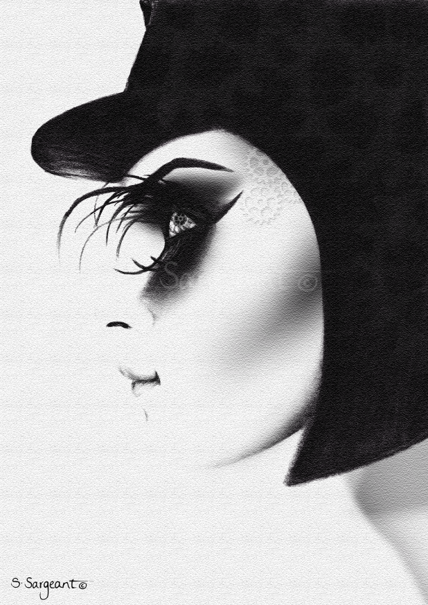
I resulted in depicting haute-couture fashion through theatrical makeup - due to practicality and accessibility. Using black card and an old eyelash case, I was able to D.I.Y some abstract false lashes for the top and bottom of one eye, in order to redesign the effect in the original film. This, along with the black smoky eye-shadow, helped to create the 'savage-beauty' appearance, which was also emphasised with the feather-texture.  
I reversed the gender within the film, to see how it would affect the meaning and perception of the footage, as many feminists have disputed the film to say that it has acts of misogyny. Also I feel that in contemporary fashion, females are a typically commercial way to sell, and thus will attract my 18-35, female target audience. 


Postage stamp designs and packaging

I decided to opt for high-contrast black and white photographs for aesthetic style, as well as to exaggerate the idea of contrast and conflict (also the dark humour within the films content). I also

utilized pastel orange/peach as I was highly influenced by fashion magazines, Vogue in particular, and to also tie back to the title 'A Clockwork Orange'. VUE CINEMA was created in the DubielPlain font, which was the closest to the 'Vogue-font' that I could find, as I wanted my designs to look like a fashion magazine cover. Avenir Black and Baskerville were often used as they are more convenient for smaller sizes. 


Magazine jacket

Magazine spread


I thought that creating a mini-magazine would be a unique adaptation of cinema brochures; it also allowed me to be active with fashion-publishing. The postage stamps and billboard were designed like a special-edition magazine, while the interactive newsletter was inspired by Vogue's publisher, Conde Nast. All of the designs are sleek, and clean, while the photographs are a bit more dark and grungy. This allowed me to reflect the contrast in the film with my contrasting design elements and to also make the design works easy to read, but with an interesting punch 


Entry ticket/coffee sleeve


Friday, 16 January 2015

A fashion adaptation of Stanley Kubrick's 'A Clockwork Orange'


'A Clockwork Orange' is a controversial and a very juxtapositional piece; Alex (the teen protagonist) is a primal savage - a civilised, primal savage who's interests extends to art, Beethoven, rape, violence, and murder. Following my perception and research of the film, I believe that the overall conclusion to the film is the conflict of two minds: the intellectual creative side of man, vs. the primal side. We clearly see this conflict in the scene where Alex chooses to defend himself against a Beethoven bust statue, with a phallic object; this emphasises the idea of the mind vs. the body.

As a designer who relishes particularly in fashion illustrations I have decided to approach this theme through fashion. My theoretical adaptation of Kubrick's 'A Clockwork Orange' will be that all of the characters are costumed in theatrical, haute-couture fashion, possibly inspired by Jean-Paul Gaultier and Alexander McQueen. Fashion has always been considered a depiction of someones status and wealth - particularly obvious
in the 1600's where fabrics, dyes and embellishments along with choice of garments would depict such things. Thus relating to the theme of the film, fashion would equal the creative, intellectual, cultured side of the brain. However, I will contrast this by using 'Savage-Beauty' and very theatrical, anarchist makeup/fashion accessories to bring out the primitive, primal side.

Charcoal on paper and photoshop. Visual demonstration of my idea.
I decided to reverse the gender within the film, to see how it would affect the meaning and perception of the footage, as many feminists have disputed the film's content to say that it has acts of misogyny.

Also I feel that in contemporary fashion, females are a typically commercial way to sell fashion and beauty, and thus may attract more of an audience to the film.

When thinking of the visuals of this campaign, images such as Black Swan come to mind, Alexander McQueen, Jean-Paul Gaultier, theatrical makeup, high fashion. In terms of visual communication, I imagine high-contrast, black and white images possibly with hints of orange just to add a pop of colour and to also tie back to the title 'A Clockwork Orange'. The fashion will be steam-punk due to the use of cogs and gears, with an anarchist vibe.


Wednesday, 7 January 2015

Pocket Monet

For my most recent brief at University of the Arts London, London College of Communication, I was required to create a pocket-sized 'something' which represents researched information about our elected personnel. The name that I popped out of the envelope was Lord Baden-Powell. This is what I came up with...


After days of extensive research, I understood that Lord Baden-Powell was a member of the British Army and founder of the Scout Movement. Due to this, his sister then ran the Girl Guides Movement. An interesting part of my research, was that Lord Baden-Powell (L. B-P) was arguably a repressed homosexual. I discovered this information primarily from my Grandad, who seems to know something about everything, and then backed up this finding by reading journals, such as 'Lord Baden-Powell' by 'Tim Jeal'. The text quotes that "Baden-Powell was in a position of public trust which made watching, at one remove, almost the only way for him to satisfy his interest" (page 96), "The available evidence point inexorably to the conclusion that Baden-Powell was a repressed homosexual" (page 103). Following this finding, I then decided that I would like to design a Scouts Badge (fabric patch) which celebrates acceptance of everyone's sexuality - thus, an award for 'Love and Humanism'.

Of course I researched existing products to inform myself of composition, colour schemes, size etc. I also looked into Gilbert Baker - the designer and creator of the LGTB Rainbow Flag, and soon discovered the 'Pink Triangle', the second most popular and recognisable symbol for Gay Rights (second to the Rainbow Flag). The Pink Triangle was originally used in Nazi concentration camps as a way of categorising and identifying homosexuals. During this time and for this purpose, the triangle was actually a down-facing pink triangle, and thus has now been reversed to an up-facing triangle, to give the symbol a positive meaning supporting Gay Rights. A Pink Triangle surrounded by a green circle stands for alliance with homosexuals, and a space free from homophobia. 


So I knew that my design would have a Pink Triangle, surrounded by a green circle; would contain the phrase "Principle and Practice of Love and Humanism" (later condensed to "Love and Humanism") and also the Scout Movement symbol.
After visiting Lord Baden-Powell House in South Kensington, London, I discovered his signature and also a statue of his appearance. Using this, I illustrated his portrait using a permanent marker and Adobe Illustrator and copied his signature. 


After playing around with composition and having the layout that I was happy with, I decided to adjust the colours. I opted for a Khaki colour scheme to reflect Scouts, using earthy tones of green, beige and brows, along with the hot pink shade for the Pink Triangle. In terms of finalising the product, I had hoped to have the badge embroidered. However as I wanted the size to be 5cm x 5cm the company informed me that my design was 'too complicated' and so that size would not be suitable. Also the shades would have to be altered as they couldn't stitch the colours of my original design. As an alternative, I used Heat-Transfer to transfer my design onto canvas fabric re-used from my unwanted tote bag (very Scout-Like/Brownie-like of me!).
Overall I am happy with the design. There are small elements which make it more appropriate to my idea, such as the adaptation I made of the scout emblem (I changed the stars on the fleur-de-lis to Lesbian and Gay symbols) and I feel that the colour scheme worked well as the Pink Triangle advances from the Khaki shades. I am also happy with how the portrait resulted and also the overall composition. I would have liked to have played around with some old fonts that were commonly used during L. B-P's life time and of course would have preferred an embroidered product. However I feel that this piece reflects L. B-P well, as a repressed homosexual Scout-Movement-founder which of course was the purpose of my brief. Oh, and it fits in my pocket at 5cm x 5cm!