Tuesday, 17 October 2017

A Statement to LIVE and WORK by | Final

Who am I as a designer? During my presentation I acknowledged and expressed how my own personal works tend to have lots of depth and meaning, as I like to use my skills as a visual communication designer to provoke thought and expose social issues. I have identified my own personal reasons to why I have a passionate approach towards social equality (as identified in my previous post, click here to read) so that I can better understand where this drive comes from and why am I this way as a designer as well as a human. I also feel that as a millennial, we are the future generation and we have the power and voices to be heard if we want ideologies to be altered. Expanding on this, I feel as though my generation are more exposed to issues than previous, due to the internet playing a dominating role within our age. We are able to speak anonymously (or not) and freely, to reach an intercontinental audience with information and opinions, which is a unique aspect compared to previous generations.


For this project I began with basic, standard manifestos - a set of rules that I will aim and aspire to follow throughout the remainder of my time at university as well as my life. However I felt that these manifestos/rules were too standard and didn't say anything about me personally, as a unique and individual designer or what I stand for. Thus recapping on my presentation where I identified that social issues tend to drive most of my more passionate works, I realised that this project and any project from here on shouldn't be any different.

Letting my social activist side take over, I began to write a list of rules that have been set in place due to my gender, class and race, that I feel I am forever trying to break. I always feel the pressure of intersectionality, as every aspect of my identity overlaps with a minority class, such as my gender and ethnicity. These invisible rules that no one talks about but we feel subconsciously pressured to follow have been clearly listed within my piece.

I wanted to spotlight these invisible rules so that they could be reviewed and made visible, so that we can consciously be aware of the perimeters set by those who do not feel the constraints of a minority identity and a society that wants to keep 'us' within our lower position.

I was inspired by the Guerrilla Girls and their use of witty copy to expose issues within the Art community, so as millennial, who's childhood was shaped by the rise of technology, I opted for a list of Terms and Conditions as I am targeting my piece towards a likewise generation who have the power to promote change within our future, and this is a common colloquial that we speak. Utilising this vernacular I then outlined the rules of our oppression that I wanted to expose. Terms and Conditions are a formality that everyone tends to ignore. We scroll straight to the bottom and click "I confirm" just so we can hit next. No one reviews them, and no one questions them; just like our assigned place within society.

A sans-serif typeface is often used when outlining Terms and Conditions, so I adopted this visual language to echo that, as well as to make my work as legible as possible, modern and also aesthetically 'stripped'. I want people to stop and read, not just glance and move on. The concept and subject matter of the information and the copy is stronger and more important than a pretty picture or an interpretation. I want to be as clear as possible and have no visual 'waffle'. By photocopying and printing this poster on standard copier paper in greyscale to redistribute around London, I am emitting a street-art, protest language to prove that power, money and/or status is not required to make a change and to expose issues.


I didn't want this to be a hate piece against those who may enforce these rules upon the lower members of society, so I refer to the force enforcing these rules as 'LIFE' and 'SOCIETY', even though our only rule set by life is to reproduce, evolve and die. Thus by 'LIFE' I do not mean in the biological natural sense, I mean life as in existing as a human within our current conditions.

The thought behind this piece is that when we are born we are instantly categorised and our identities set due to conditions beyond our control such as our sex, where our parents were born, where we are born, how much money our family earns etc. By being assigned a category before we are even born, 'SOCIETY' already assigns these sets of rules despite our wishes; thus my piece exposes not only the rules, but how we play no part in agreeing or disagreeing with our conditions or role within society.

My aim is to break these rules and encourage others to do the same. I want to amend the terms and conditions of 'LIFE' that was agreed to, not by me, but 'SOCIETY' due to conditions that were beyond anyones control. I aspire to be outspoken, bold, loud, fearless. I want to shake the hierarchy and turn it on its side. We are all humans. There is no biological food chain amongst us. Naturally we are all equal in terms of prey and predator, so I want to expose this unnatural hierarchy that humans have self-enforced. My manifesto is that I want to deface the rules (terms and conditions) imposed on me due to my position within this hierarchy and I hope to encourage others to do the same.

Monday, 16 October 2017

A Statement to Live and Work by | WIP

I live by many manifestos; we all do even if you don't notice it or are consciously aware. It's a subconscious ideology that can be found within your depths, thus when you look internally you can begin to understand and analyse why you do some of the things that you do.

I originate from a working class background, I am a female, I am mixed race and I assist with the care of a disabled member within my family. I am the complete opposition of white supremacy, neo-Nazism and obviously 'male privilege' - whatever that is.

Being the underdog voiced in many 'ideal' ideologies, I often felt these pressures, especially whilst at school, as children can be pretty mean and have no filter, voicing their confusion for something that they don't understand, doesn't appear to be the 'norm' or they just want to question. This made me question myself. I questioned my ethnicity, my hair colour, my features, my 'abnormalities'. I disregarded 50% of my ethnicity and replaced it with a more socially acceptable alternative - my Swiss/Italian decent. I became ashamed of being considered a 'paki' due to having a parent from India  and I also became fed up of being a female and all of the things that came with it.

Guys would disrespect me by sexually objectifying me and I went through a period of feeling no self-worth. I've always felt like I had something to prove. I had to prove that I was more than a 'paki', more than a sexual object, more than a 7/10 or whatever they wanted to label me that day and additionally I was fed up of being poor and being subtracted from many activities. This anger, turned into my feisty and fierce ambition to constantly improve myself, learn and grow so that I can validate my worth with my brain and my skills beyond my external features.

Analysing this honesty, I can now pin point why I feel strongly towards social activism and why I am a strong advocate of equal rights. We are not our skin colour, our gender, our class, our physical abilities. We are intelligent humans and there shouldn't be a hierarchy amongst us, we are already at the top of the food chain, so why are we making a food chain within ourselves? Categorising some humans as prey and some as predator. We are all the same, our only differences being environmental variables.

My manifestos are that I will not do what this ridiculous hierarchy expects me to do, as essentially, like many others I am at the bottom of the pecking order. I will acknowledge issues. I will voice my opinions. I will be loud and bold. I will make my own identity. I will be fearless. I will be ambitious. I will take risks. I will cross boundaries and borders.


Tuesday, 10 October 2017

Driving - Krazee Ft. Maze | (Official Music Video)

Watch Krazee's new video for "Driving".
The new EP #4 is Available Now on Spotify http://spoti.fi/2hQN2Ho.

Music video by © 2017 Sophia Sargeant


Monday, 9 October 2017

Personal Projects

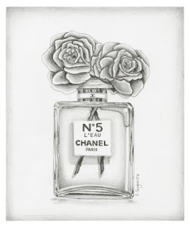
If you read my previous post, you would know that I had some issues between creating art because I love it, and creating art because I was paid to do so. You can get very seduced by the world of design and your clients (not literally of course), and so you end up saying yes to every project, and wearing yourself and your creative spark, out. The issue with working is that you very much spend your day creating what other people want you to create, and you forget what it is that YOU want to create. My summer was packed with assignments which I am entirely grateful for, but I had little time to do my own thing. Luckily, I'm a fast worker, and I have a good relationship with one of the agencies that I work for, and so when I had completed what needed to be done and I had some free time, I picked up the nearest tools around me - a biro pen and some paper - and I began drawing.


I don't think I have ever drawn seriously with a pen before. I have only ever done quick sketches and 'scribble' drawings (my lazy, faster version of cross hatching). So I discovered a new skill that I didn't know I had, and I just drew things that I admire and enjoy. I used to create a lot of fashion illustrations when I was younger, but until now it's probably been around 3 years since I last created anything within my personal work related to fashion.

I'm not going to lie, I love these drawings. They reflect my personal aesthetic which is often high contrast black and white and quite sleek. They match perfectly with my own space now they have been framed, and they are designers and iconic pieces that I personal love and feel inspired/motivated by.

I did also pick up a pencil when I got home, and I created a 'mini' drawing, which is possibly around the size of an A6 card, but not the exact dimensions. I definitely want to do more of these, as they didn't take too long to do and they were quite therapeutic for me mentally and creatively.

I've missed drawing. I've missed loving fashion. And I've missed just sitting down with music blasting and letting my brain spill on a piece of paper with no deadline or second party to please. I 100% vow to do more work for myself in order to keep me sane and to ground me & my creative works back to who I am.

If you're interested in purchasing one of my drawings, I have set up a page where you can do so: http://sophiasargeant.bigcartel.com


Sunday, 8 October 2017

It's been a while!

As the title suggests, it has been a hot minute since my last post. I have been enjoying the summer and just focussing on my work and personal projects without putting additional pressure on myself to turn it into something more. Sometimes I forget to create art for me, and I forget why I love it so much; but I'm glad to say I'm back with a fresh mind, the urge to create and the fire.

So lets do a quick recap/run down over the summer :


1. I saw my works on 5th Avenue in New York City - INSANE! I'm pretty sure the employee's in the store thought I was absolutely nuts!
More images and information can be found here: http://sophiasargeant.co.uk/karen-millen-ss17

2. I artwork the window designs for Selfridges on Oxford street which I am still in total shock about! These even featured in TimeOut - of course my name is no where in sight but that's not the point!
More images and information can be found here: 
http://sophiasargeant.co.uk/selfridges

3. I worked at a creative agency in Piccadilly Circus called Red Consultancy. I worked on a long list of clients and thoroughly enjoyed my time there as well as the location. The clients I worked on include:
Activision, Adobe, Aldi, Boots, Caterpillar inc., McDonalds, Robinsons, Slim Fast, Yodel and more.
More images and information can be found here:
http://sophiasargeant.co.uk/red-consultancy


Tuesday, 18 April 2017

DA&D Brief: Respect for Animals. Fighting against the fur trade.

As a response to my DA&D brief for Respect for Animals, I decided to respond to the task of generating a social media campaign through designing an interactive and subconsciously educational game, that has hard hitting facts - shocking you at the end and provoking emotive and sympathetic reactions. 

The way in which I have tackled this task has been a challenge. I have never created a game before so this project has been a way for me to learn new programmes in depth (Adobe After Effects) and to learn new skills such as frame by frame animation. 

How can I attract a large audience without turning them off by ‘preaching’ about my activist views on the fur trade? I began by sketching my ideas and jotting down varies copywriting phrases, to ensure that I was communicating in the best way possible. I opted for a light, warm, happy game at the opening; that soon has a dramatic turn. 

I designed the beginning of the game to simulate the act of choosing your pet at a shelter: selecting the breed, the gender and to name (and bond with) your pet. This way you become attached to your pet, and you can not wait to bring them home and begin to love them as part of the family. Just as a mother would feel about her baby. However, while you’re in a happy state with bouncy, joyful tunes and playful, innocent colours such as pastel blue and pink, your pet has been ripped away and thrown into a fur farm. The purpose of the game is to help your pet to escape; which you soon find us impossible and once your pet has been caught, he/she is murdered brutally and finally placed on a hanger in stores. The levels throughout the game subconsciously tell you the journey of the slaughterhouse, the conditions of fur farms and also the circumstance in which each breed is slaughtered - just in the name of fashion. 

I chose the typeface ‘daddy’s girl’ as it’s friendly, childlike and thus, innocent, reflecting the animals. 
Fur is not a by product of meat etc. As we do not eat fox, mink etc. Thus they are bred, abused and murdered just for their skin. They are seen as a ‘business’ and not as individual lives with emotions and personalities. We too are animals: if murder among our own breed is wrong, so is murder across species.

Using Photoshop, I transformed my hand rendered illustrations into animated digital art, as each pet has their own personality and trait. For example, the dog raises his ears and tilts his head to you when you hover over him, making him more lovable and realistic, due to the personality. Furthermore, I based the domestic animals on my own pets; this way I hope to emphasise how we should view these animals as family members and individuals, not a fur coat.

I hope to change opinions with my game through education. I do not aim to preach or force spectators into my activist views: but to ask them to be aware of not what they are buying, but who they are buying and the process that animals go through for one unnecessary, luxury item. I aim to teach my spectators, and also provide them with a game that is fun and enjoyable (also frustrating and lacks hope as it’s impossible to win) in the hopes of it becoming viral throughout social media. Even if they play the game just for the game as opposed to the message I am content, as subconsciously they will be being educated. The power of hosting the game on a social platform such as Facebook, gives the project an opportunity to be accessed worldwide. 

Link to game play: http://sophiasargeant.co.uk/secret-project-wip

Monday, 13 March 2017

D Factor design concept

UK garage originated in the early 1990’s as a genre of electronic music; and was a music scene that existed during my childhood. As I was born during the peak of garage, in 1995, I decided to create a garage track using samples, as I wanted to create music inspired by sounds that I appreciate and that would be suitable to be transferred onto a vinyl record (anything that hints more towards pop-culture would have been too modern for it’s purpose). I particularly enjoy Urban music, and so I wanted to follow that, as I appreciate the multi-cultural influences.

In order to make my track recognisable as garage, I used distinctive percussive rhythm, hi-hats and snares - I did also include some beat-skipping kick drums. In order to be entirely truthful to my genre, I incorporated a commonly used feature within garage, pitch-shifted vocal samples that complement the rhythmic structure. 

In order to create this track, I wanted to use DJ style software, as though it was a track being constructed in an underground club in London, there and then. As the 90’s saw the emerge of technology I wanted to use software that exists due to this evolution; thus I decided that I wanted to use an app as opposed to other music production methods. My 2.5 year old brother actually showed me a music making app that he had on his iPad called, LaunchPad. I decided that I wanted to use this, as it was exactly what I was seeking; as you have a selection of samples that you must activate or deactivate while you record the whole track, live. 

I think it’s interesting that in contemporary cultures toddlers now have advanced technological knowledge in comparison to past generations. I wanted to incorporate this ideology within my work, by using the app that is on my toddler-brothers iPad, that he can utilise and actually taught to me. 

Issues that I would like to explore within my design of the record cover and music video include: multi-culturalism, children and technology. I may also like to include nostalgic links between the 90’s and present day, and the London underground scene. 

Link to my song: https://youtu.be/E8oSm1bkcIU


Update:


Hand cut stencil used to hand emboss 300gsm black card


Tuesday, 7 March 2017

Sending Out a Flare to Dr. Martens


Kayleigh and I began our line of communication with Damien Wilson (Creative Director) from Dr. Martens, as we wanted to attract his attention in order to encourage him or his creative team to give a talk at University of East London. 

Inspirations also included Allen Jones
We began by researching his background, in which we discovered that he was a teenager during the 1980’s, a time where Punk and other sub-cultures were thriving in England. This influences his work at Dr. Martens, as the heart of the brand and himself is music, rebellion and youth; thus he still reflects back on his 80’s youth. Dr. Martens market themselves at nonconformists, British subcultures, and focus on individuality, anti-establishment and vintage-heritage; while they began by supplying for working class members such as postmen who needed affordable, comfortable footwear. 


I wanted to harness all of these traits in order to create my final piece/flare. As the brand focusses on footwear, I didn’t want to supply Wilson with a foot, thus I wanted to supply him with the next best thing - a leg. Alexander McQueen (someone who I often turn to for punk inspiration) once said “I find beauty in the grotesque, like most artists” and this was something that inspired me, as realistically, a single, unattached leg spikes thoughts of endless possibilities for why the leg has been severed from the body, often making the conclusions quite grotesque. However, by styling these legs, we have ‘beautified’ the grotesque with the use of embellished materials that are often linked with British subcultures. I myself focussed more on glam punk, while Kayleigh explored a more vibrant, flamboyant subculture. 

I had to source the materials most suitable for the subculture and music genre that I was responding too, and also keep my eye on the budget as the heart of the brand stemmed from the working class - not to mention, the punks kickstarted the DIY movement and so I wanted to create something quite thrifty and unique. 

Once the legs had been completed we failed to source a box that would accommodate the two legs for postage, so we had to think of an alternative. I photographed my leg in various positions, hanging from a chain lead, in an almost bondage style. I tried making the leg appear as though it was pushing through the wall in a weird psychedelic, warped world in order to give it a strange personality. The images that I found most aesthetically interesting were the abstracted images where I focused on close ups. These images make the spectator intrigued, and provokes thinking and problem solving, while also showcasing the variety of textures used throughout the leg styling. 


As I am taking inspiration from 1970/80’s British subcultures I wanted the photographs to reflect that period. I explored taking the photographs with and without flash, and soon discovered that the flash photography enhanced the reflective fibres within some of the materials, giving a grainier, grungier appearance. The white backgrounds also transformed to dark grey/black due to the camera focussing on the visual merchandise. These images didn’t require retouching. Once I imported them into photoshop the images looked just how I would have liked and I was thrilled about this, as back in to 70/80’s raw images were often used within the punk industry to expose the truth, as the movement had a political ideology that focussed on expression and being open. I did however, reduce the resolution slightly and add a grainy texture in order to remove the perfection from modern, 2017, technology. 


I printed these images on 4” x 6” photo paper, as once again I wanted to simulate the era through the nostalgia of photographic prints as traditional photographs. My printer has a slight collaboration issue, where the photos printed with a green tint. Even though this was unintentional, I decided to utilise this as a feature instead of reprinting, as I liked the vintage quality it gave to the image, as well as the imperfection and hint towards steam punk. 


My photography

Kayleigh was happy with these images, so she photographed some un-staged close ups of her more flamboyant leg, for me to edit and print in the same way in order to keep consistency. I like how her images were un-staged, and there is more truth and purity to her images, while mine were more referenced towards the DIY movement by setting up my own scene in a makeshift environment. Both are suitable to the brief and work well together.


Kayleigh's images, with my editing

Finally, we had to solve the issue of postage. What were we going to post the photographs in? Kayleigh suggested redesigning a sleek, and modern box that she obtained from designer store, Choice. I liked this idea at first, but upon further thought realised that it was appealing more to our own style, rather than towards Damien Wilson, Dr. Martens or the British subcultures. The design would be too perfected and neat for our intentions. I decided to take a risk. I thought of just throwing the photographs in an envelope and being entirely direct and completely ‘punk’, however Kayleigh opposed dramatically of this idea, so I had no choice but to convince her. 

I made a prototype using A4 paper to throw together my own ‘envelope’, sealing it on the back with thick, black gaffa tape, a hand made label and a touch of yellow thread as a response to Dr. Martens branding. I convinced Kayleigh by sending over the images along with the following passage: “Punk is all about the DIY (do it yourself) movement, and going against rules and what ‘should’ be done. So essentially, throwing everything that we SHOULD be as designers away, and doing what we shouldn’t be doing, or what goes against conventional design methods. The photos are professional quality, so he [Damien Wilson] will know we are not being lazy. And he understands the alternative movement so he should find this refreshing. A sleek modern box is great - totally our style, but is it his? We need to design for the movement, the theme and the brand; not our own personal aesthetic. Hence why I think this is stronger. The point is to be risky and do something out of our comfort zone. A hand made envelope does that. We can print the address label on the photo paper too so it still has that luxury quality to it and then the post office will add a stamp to it to give it even more character”


Kayleigh still needed further convincing, so I allowed her to experiment with the Choice box, while I compromised with my DIY-envelope by making it feel more durable and luxury. Just by increasing the paper weight, and printing the label on photo paper rather than ordinary copier paper made the design more crisp, while the slapped-together movement accompanied with the industrial gaffa tape grounds it back to my initial intentions. As a result, the box redesign didn’t work out too well, as so we posted the photographs in the designed un-designed DIY envelope. 


Overall, I am happy with the project as it helped me to rethink design, by unthinking it. I had to do what designers are told we shouldn’t do, such as using a mobile phone for photographs instead of a modern DSLR, packaging our raw photographs in a hand made, messy envelope and also throwing a load of materials on a single body part in a totally free, and unplanned process. Of course, this was all intentional in order to aid the aesthetic and aim, but it helped to open my mind from the rules and constraints of the design industry.


As an update: We decided to include an invitation within the envelope too invite Damien to give a lecture at our university, UEL. We hope to hear from him shortly! 


Rethink

As a solution to the current Refugee Crisis many have suggested that we provide the victims with their own country; this idea has been disapproved as critics say that it’s based on exclusivity. I would like to revisit this idea, as personally, I feel that exclusivity is less of an issue than discrimination that they face in other countries, and murder and suffering that they face in their own. 

My creative response, inspired by Jenny Holzer
I started by researching the least populated locations. Of course this predominantly included deserts; thus my first question was “how could we make the climate and drought in the Australian Outback and/or Namibia habitable for humans?”. 

Another possibility is Pitcairn Island, owned by the British, but in close proximity to New Zealand. Currently, to live on Pitcairn Island it’s calculated to cost and average of $9,464 annually, with an income of $6,000 a year, vs. the current costs now which is $12,874 a year per refugee. We can also improve homelessness by giving homeless people and unemployed people the opportunity to move here. They can build the environment to accommodate more stores, schools, homes etc.

New York is one of the most densely populated (if not the most) location with 8,550,405 (8.5million) people in 789 km². In order to calculate how people people live in 1km² of NYC (the population density) I divided the population by the size of the area, thus, there are 10,837 people per km² in NYC. If we were to house the refugees on Pitcairn Island and allow it to be as densely populated as NYC (knowing that this is possible) I calculated the possible population density of the Island. As there are there are 10,837 people per km² in NYC, we can times 10,837 people per km² for the Pitcairn island which equals 509339 (5 hundred and 9 thousand 3 hundred and 39) people; thus 509339 (5 hundred and 9 thousand 3 hundred and 39) people can inhabit the Pitcairn Island if populated like NYC. “Record 65 million people forced to flee homes, UN says” That leaves us with an outstanding four million four hundred ninety thousand six hundred sixty-one refugees to house, so this Island doesn’t completely solve the issue. 

The least densely populated location in the world is Greenland; thus if we apply to above calculations we come to the conclusion that Greenland can house: 21674000000 refugees. Thus 21 billion 6hundred and 74million people can inhabit Greenland alone if populated like NYC. Greenland can accommodate the 65million refugees easily. They can set up their own community there and people who are unemployed/homeless can also go to Greenland and help build the community: housing, schools etc. Young people can volunteer to help, which builds their CV, and employability, including cheap housing. 

Greenland is the worlds largest non-continental Island but 3/4 is covered by permanent ice sheet. So if we calculate the 1/4 that isn’t covered with ice (500000 x 10,837 = 5418500000) 5 billion 4hundred and 18million 5 hundred-thousand can inhabit Greenland (avoiding the ice) if populated like NYC.

There is no issue in Greenland for agriculture, as Southern Greenland thrives with farms and luxuriant vegetables. “The sea is rich in fish and invertebrates, especially in the milder West Greenland Current” as “Approximately 225 species of fish are known from the waters surrounding Greenland, and the fishing industry is a major part of Greenland's economy, accounting for approximately the majority of the country's total exports.” Greenland also provides more jobs as the Island is abundant in minerals and ruby deposits began in 2007. Other minerals that can be extracted from Greenland include iron, uranium, aluminium, nickel, platinum, tungsten, titanium, and copper.”


On average, each Middle Eastern refugee resettled in the United States costs an estimated $12,874 per year per refugee, therefore It currently costs $836810000,000 (8hundred 36billion 8hundred and 10 million) a year on all the refugees. Thus, that money can be put into Greenland to cover the costs of building, wages etc. Every country can chip in to this fee, so that it’s a worldly effort in order to assist those in need. It will encourage the refugees to work and will also give them a safe place to inhabit. By giving the refugees a choice we are not subjecting them to exclusivity, and by Greenland being able to actually house more than the whole population of humans on Earth, anyone could be welcome to live there; so exclusivity is a minimal issue. 

Update:


Inspired by Richard Mosse's Exhibition at Barbican 


Wednesday, 1 March 2017

Everyday Objects

As a starting point, we acknowledged that communication is key for a sucessful collaboration. Kayleigh and I discussed our strengths and weaknesses, and found a common theme: our illustrative style. We felt that we wanted to abstract the products, by stripping them back to their minimalist form and exhibiting the elements that speaks for the product itself. 

We began by collecting the following information from each product: it’s shape, typeface, atmospheric aura and it’s colour scheme; as we felt that when these elements were combined for each product, we could communicate the items through their iconic signs, rather than indexical imagery. Sticking to the abstracted, minimalist ideology, we extracted only one letter from each product’s title to be the foreground of our designs. The characters that we chose were thoughtfully selected: for example, the K from Pukka has a decorative design blooming from the character, making it identifiable even when removed from its context. Some were not as straightforward as this, and we selected them due to composition: did we we want the y-axis of the ‘t’ or the x-axis of an ‘M’? Would an uppercase or lowercase letter work best within this space? And did we have a good variety of letters? 

Using our combined illustrative skills and styles as an advantage, Kayleigh and I wanted to capture the mood, texture and/or function of the product by producing hand rendered backgrounds. Here we focussed on pattern making, colour schemes, composition as well as diversity. Each product has its own unique design that reflects itself in an abstracted, reduced form. 
As we have a diverse illustrative skill set, no two pieces are the same. To create our designs we focussed on pencil drawings, pen illustrations, digital art, paintings and lenses based imagery; thus we were able to experiment with a variety of techniques, each being applicable to the product.

Due to our separate styles, our designs have a nice juxtaposition while complimenting each other. For example, Kayleigh’s designs are busier with more bold colours, while my own are more reductive and minimalist. Aesthetically these work well together and there is a great balance of the two. 

Taking inspiration from the product ‘EMILY CRISPS’ we used didot as the header for our essay designs. Originally we used this type for the body too, but felt it’s wasn’t legible enough once we printed a test. We definitely wanted a didone style typeface with the medium contrast between thick and thin, thus we selected Baskerville for the body. Once printed there was no issue with the legibility.

As a printed catalogue felt too mundane for our ‘abstracted’ pieces, we decided the we would like to suspend our designs from the ceiling. We sourced a long, sleek corridor to help enhance our designs and opted to hang the pieces in the centre, one design behind the other. This way, we are still providing the spectators with the mystery of turning a page, but by making them walk past each design. 
By suspending the pieces in the centre of the corridor we are being shouty, a nuisance and unavoidable: the elements of advertising in this consumerist environment. 

As there are layers to our designs, we wanted to play on this rather than creating flat 2D designs. We printed the characters on a sheet of acetate (as a more budget-friendly alternative to glass) and hung these just before the backgrounds, making the distance between the foreground and background provide a 3D illusion. 

Update:
We decided to develop our idea further and create a complimenting catalogue also.